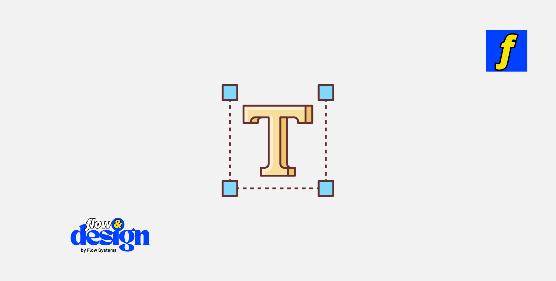
Typography is an essential element in design that can make or break your project. It plays a crucial role in conveying your message effectively and creating a visually appealing layout. Whether you are a seasoned designer or just starting out, mastering typography tips can help you take your designs to the next level.
In this blog post, we will explore some valuable typography tips that you can use to enhance your design skills and create stunning visuals that captivate your audience.
Importance of Typography in Design
Typography is more than just choosing a font and size for your text.
It is about creating a visual hierarchy that guides the reader’s eye and communicates the message effectively. Typography helps to establish the tone and mood of your design, evoke emotions, and enhance the overall user experience. A well-thought-out typography can make your design more engaging and memorable. By paying attention to typography, you can create designs that are not only visually appealing but also easy to read and understand.
Choosing the Right Font
One of the most crucial aspects of typography is choosing the right font for your design.
The font you choose should complement the overall theme of your design and reflect the message you want to convey. When selecting a font, consider factors such as readability, legibility, and appropriateness for the context. Experiment with different fonts to find the one that best fits your design and enhances its visual appeal. Avoid using too many different fonts in a single design as it can create a cluttered and confusing look. Stick to a few fonts that work well together and create a cohesive design.
Serif vs. Sans Serif Fonts
Serif and sans-serif are two main categories of fonts that are commonly used in design. Serif fonts have small lines or strokes at the ends of the letters, while sans-serif fonts do not have these embellishments. Serif fonts are often considered more traditional and formal, while sans-serif fonts are perceived as modern and clean. When choosing between serif and sans-serif fonts, consider the tone and style of your design. Serif fonts are often used for body text in print materials, while sans-serif fonts are popular for digital designs and headlines. Experiment with both types of fonts to see which one works best for your design.
Font Pairing
Font pairing is the practice of combining two or more fonts in a design to create contrast and visual interest. When pairing fonts, consider factors such as font size, weight, style, and spacing. Choose fonts that complement each other and create a harmonious look. Pair a decorative font with a simple, clean font for contrast, or combine two similar fonts with different weights for emphasis. Avoid pairing fonts that are too similar or clash with each other. Experiment with different font combinations to find the perfect pairing that enhances your design.
Ready to elevate your web design with stunning typography? At Flow & Design, we specialize in creating visually impactful websites that seamlessly integrate expert typography for a professional look. Whether you’re looking for font pairing, custom design, or complete website creation, our team is here to help you make a lasting impression.
Let’s bring your vision to life! Explore our pricing options and start your project with us today!
Typography Hierarchy
Typography hierarchy is the arrangement of text in a design to create a visual flow that guides the reader’s eye.
Establishing a clear hierarchy helps to emphasize important information, create structure, and make the content easier to read. Use different font sizes, weights, and styles to distinguish between headings, subheadings, body text, and other elements. Make sure that the most important information stands out and is easily accessible to the reader. Experiment with typography hierarchy to create a well-organized and visually appealing design.
Use of White Space
White space, also known as negative space, is the empty space around and between design elements. White space plays a crucial role in typography as it helps to improve readability, create visual balance, and enhance the overall design aesthetics. Use white space to separate different sections of text, highlight important information, and create a sense of breathing room in your design. Avoid overcrowding your design with text and other elements as it can make it look cluttered and overwhelming. Embrace white space to create a clean, sophisticated design that captivates the viewer.
Alignment and Consistency
Alignment and consistency are key principles of typography that help to create a cohesive and visually appealing design. Align text to create a neat and organized layout that is easy to read and navigate. Use left, right, center, or justified alignment depending on the context and purpose of your design. Maintain consistency in font choices, sizes, spacing, and alignment throughout your design to create a unified look. Consistent typography helps to establish a visual identity and reinforce the message you want to convey. Pay attention to alignment and consistency to create polished and professional designs.
Color and Contrast
Color and contrast are powerful tools that can enhance the impact of your typography and make your design more engaging.
Use color strategically to draw attention to important text, create visual interest, and evoke emotions. Experiment with different color combinations to find the ones that work best for your design. Consider factors such as readability, legibility, and accessibility when choosing colors for your typography. Create contrast by using light and dark colors, bold and regular fonts, or different font sizes to make key elements stand out. Use color and contrast to make your typography more dynamic and visually compelling.
Try our Color Palette Generator
Testing and Refining
Testing and refining your typography is an essential part of the design process that helps you ensure that your text is legible, readable, and visually appealing. Test your typography on different devices and screen sizes to make sure that it is accessible and easy to read. Ask for feedback from colleagues, friends, or clients to get different perspectives on your typography. Refine your typography based on the feedback you receive and make adjustments as needed. Continuously test and refine your typography to create designs that are polished and effective.
Conclusion
Typography is a powerful design element that can make a significant impact on the overall look and feel of your designs.
By mastering typography tips and techniques, you can create visually appealing layouts that effectively communicate your message and captivate your audience. Pay attention to choosing the right font, font pairing, typography hierarchy, white space, alignment, color, and contrast to create designs that are engaging, memorable, and professional. Experiment with different typography techniques to find the ones that work best for your design style and goals. With practice and dedication, you can elevate your design game and create stunning visuals that leave a lasting impression.
Products
- Learn Design Basics eBook – Perfect for beginners looking to master the foundations of design, including typography.
- Landing Page Design eBook – Learn to design effective landing pages with great typography.
- Golden Ratio Design eBook – Apply the golden ratio in typography.