
Design style of Bauhaus
Where Form Follows Function
and Design Becomes Timeless.
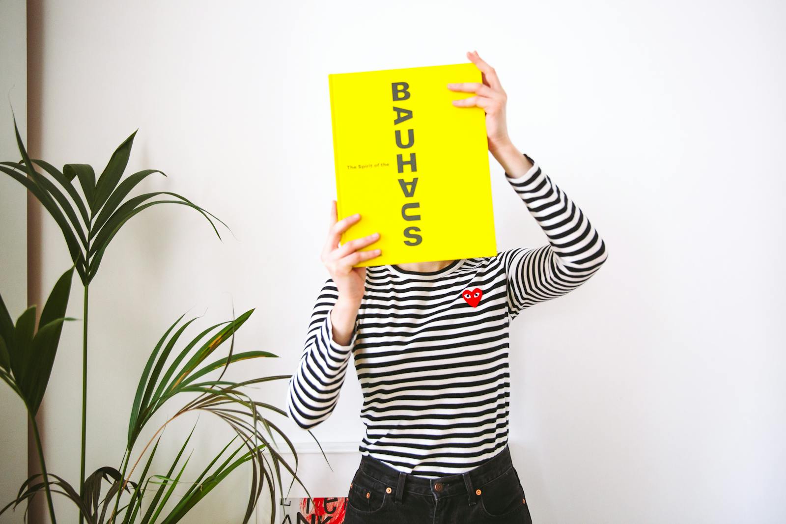
Bauhaus is a timeless design style rooted in function, geometry, and clarity. It's where modern minimalism meets industrial elegance.
Design style of Bauhaus
Where Form Follows Function
and Design Becomes Timeless.
Bauhaus is a timeless design style rooted in function, geometry, and clarity. It's where modern minimalism meets industrial elegance.
Bauhaus Design Style Insights
✅ Overall Design Score
🧘 Simplicity Score
🧠 Usability Score
🧩 Flexibility Score
🌍 Global Appeal Score
📈 Trendiness Score
🧬 Originality Score
🧱 Structure & Layout Score
🌈 Visual Impact Score
🦾 Accessibility Score
✨ Brand Versatility Score
Overview:
Bauhaus is more than a style — it’s a design movement born from a revolutionary school of thought that reshaped architecture, art, and visual communication in the 20th century. Its clean lines, rational layouts, and unembellished aesthetics continue to inspire web design, branding, and product design today. From striking geometric shapes to a fearless embrace of primary colors, Bauhaus speaks a visual language of efficiency, purpose, and modernity. It remains a go-to style for designers aiming to fuse creativity with structure and clarity.
Disclosure: Some links on this page are affiliate links, meaning we may earn a commission if you make a purchase, at no extra cost to you. Other links direct to our own brands or trusted resources.
🧬 Style Philosophy
🗺 Origin & Cultural Roots
Founded in 1919 by Walter Gropius in Weimar, Germany, the Bauhaus school merged fine art with craft. It emerged as a counter to ornate, decorative styles of the time, promoting a rational approach to design that served both aesthetic and practical needs.
📅 Time Period & Evolution
-
Emergence: 1919
-
Peak: 1920s–1933 (before Nazi suppression)
-
Modern Rebirth: Revived in digital and architectural design across decades.
🎯 Core Design Traits
-
Strong geometric shapes (circles, squares, triangles)
-
Grid-based layouts
-
Minimal ornamentation
-
Bold typography
-
Clear hierarchy and structure
🎨 Typical Color Palettes
-
Primary Colors: Red, blue, yellow
-
Neutrals: Black, white, gray
-
Purpose: Evoke clarity, energy, and universality
🖋 Typography Style
-
Sans-serif fonts like Futura, Helvetica
-
Bold, all-caps usage
-
Letterforms are often angular or geometric to echo shapes in the layout
🧱 Layout & Structure
-
Strict grid systems
-
Asymmetry used with balance
-
Modular blocks for clear organization
-
Repetition and rhythm in element positioning
🖼 Use of Imagery
-
Minimal photography
-
Abstract compositions, collage, or geometric illustrations
-
Focus on line, shape, and contrast
🔤 Iconography
-
Bold and simplified
-
Often linear or geometric
-
Designed for recognizability and scalability
🌈 Visual Personality
-
Rational
-
Industrial
-
Clean
-
Confident
-
Functional over decorative
📱 Modern Adaptation
-
Used in web design, branding, poster design, and architecture
-
Seen in minimalist UI kits and modular component libraries
-
Reappearing in modern tech and art platforms
🎨 Notable Designers or Studios
-
Walter Gropius
-
Paul Klee
-
Josef Albers
-
László Moholy-Nagy
💼 Best Use Cases
-
Tech and design portfolios
-
Editorial layouts
-
Creative agencies
-
Museum or gallery sites
-
Art schools and education platforms
🧰 Tools & Software
- SiteMake – Website Builder
-
Figma – Interface & prototyping
-
Webflow – No-code for marketing pages
-
WordPress – For content hubs
Disclosure: Some links on this page are affiliate links, meaning we may earn a commission if you make a purchase, at no extra cost to you. Other links direct to our own brands or trusted resources.
🧩 Related Styles
-
Swiss Design
-
Minimalism
-
Brutalism (as a modern conceptual contrast)
-
Constructivism
🔄 Common Variations
-
Neo-Bauhaus: Digital-first reinterpretations
-
Post-Bauhaus: Mixing Bauhaus with modernism or editorial typography
💡 UX Considerations
-
Straightforward UX that aligns with clarity and hierarchy
-
Works well with structured content or navigation-heavy pages
-
Avoid excessive flair or microinteractions
🦾 Accessibility Strength
-
Generally strong: high contrast, clean typography, grid alignment
-
Must ensure colorblind-friendly palettes when using red/yellow combos
📈 Popularity & Trend Cycles
-
Evergreen in architectural and academic spaces
-
Recently resurging in web and digital product design as designers seek bold structure
🧠 Inspiration Gallery
→ Would include real-life applications of Bauhaus templates, branding kits, and modern websites that channel the Bauhaus spirit.

🧬 Design Philosophy & Purpose of Bauhaus
The Bauhaus design philosophy is grounded in the radical idea that form should follow function. It was born from the belief that design should serve a social purpose — not just look beautiful, but enhance life, improve usability, and unify art with industry.
Rather than ornamental excess, Bauhaus favors clarity, simplicity, and structure. Every visual element — from a line to a color block — exists because it serves a purpose. The movement aimed to eliminate the divide between craftsmanship and mass production, bringing art and design into everyday life.
At its core, Bauhaus is utilitarian elegance. It invites us to strip away the unnecessary and celebrate geometry, balance, and rationality. Whether you’re designing a poster, a website, or a chair — if it’s Bauhaus-inspired, it should be honest, intentional, and timeless.
Key Takeaways:
-
“Less is more” isn’t just an aesthetic choice — it’s a design ethic.
-
Bauhaus prioritizes function, usability, and universal clarity.
-
It paved the way for modern minimalism and still influences UX/UI, architecture, and branding today.
🗺️ Cultural & Historical Origin of Bauhaus
The Bauhaus movement originated in 1919 in Weimar, Germany, during a time of political, economic, and cultural upheaval following World War I. Founded by architect Walter Gropius, the Bauhaus school set out to unify art, craft, and technology under one roof — a revolutionary idea in a world still largely divided by class, tradition, and outdated aesthetics.
Its name, “Bauhaus,” comes from the German words for “building house,” reflecting its mission to redefine the built environment through modern, functional design. The school emphasized collaborative learning between painters, architects, sculptors, typographers, and industrial designers — blurring the lines between fine art and practical craftsmanship.
Rooted in modernist ideals, Bauhaus was a direct reaction against the ornate and decorative styles of the 19th century (like Art Nouveau and Baroque). Instead, it drew inspiration from constructivism, minimalism, and the industrial revolution, embracing machine-age materials and a new democratic vision for design.
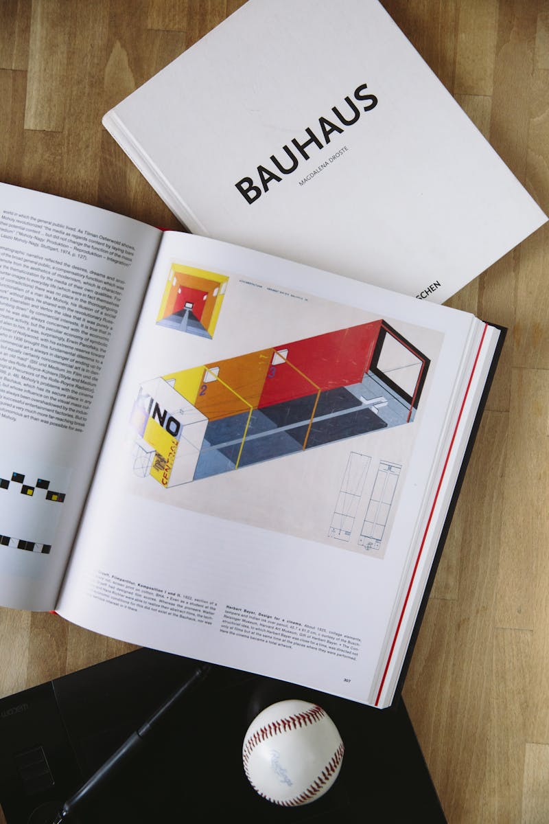
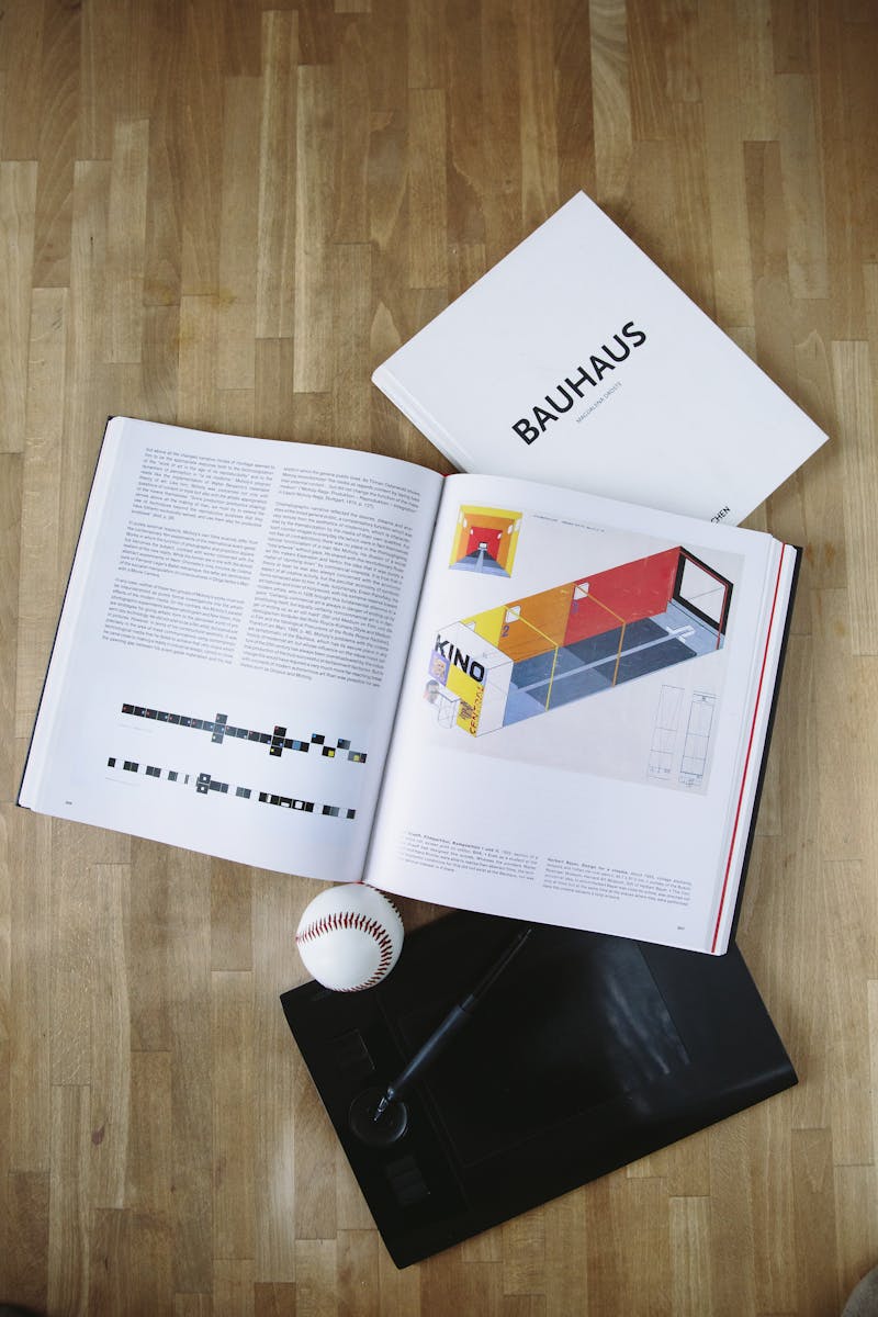
Despite its short lifespan (the school was closed in 1933 under Nazi pressure), the influence of Bauhaus spread globally as its key figures — including Paul Klee, László Moholy-Nagy, and Josef Albers — migrated to places like the U.S., where they helped shape institutions like the New Bauhaus (Chicago) and Black Mountain College.
🎯 Core Visual Traits & Aesthetics of Bauhaus
The Bauhaus aesthetic is defined by its clarity, geometric precision, and dedication to form serving function. Rather than ornate decoration, Bauhaus leans into the essentials of design — emphasizing structure, balance, and visual logic.
Here are the defining visual traits that make Bauhaus instantly recognizable:
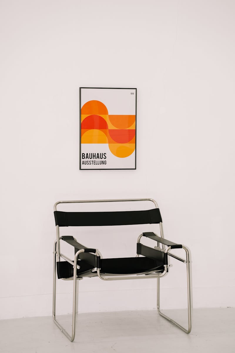
🔺 1. Geometric Shapes
Circles, squares, triangles — these are the building blocks of Bauhaus. Designs often feature pure, bold forms arranged with mathematical precision, echoing the movement’s architectural roots.
📏 2. Clean, Grid-Based Layouts
Bauhaus uses a strong grid system to create visual harmony. Content is typically organized in modular blocks, allowing for both structure and scalability in design.
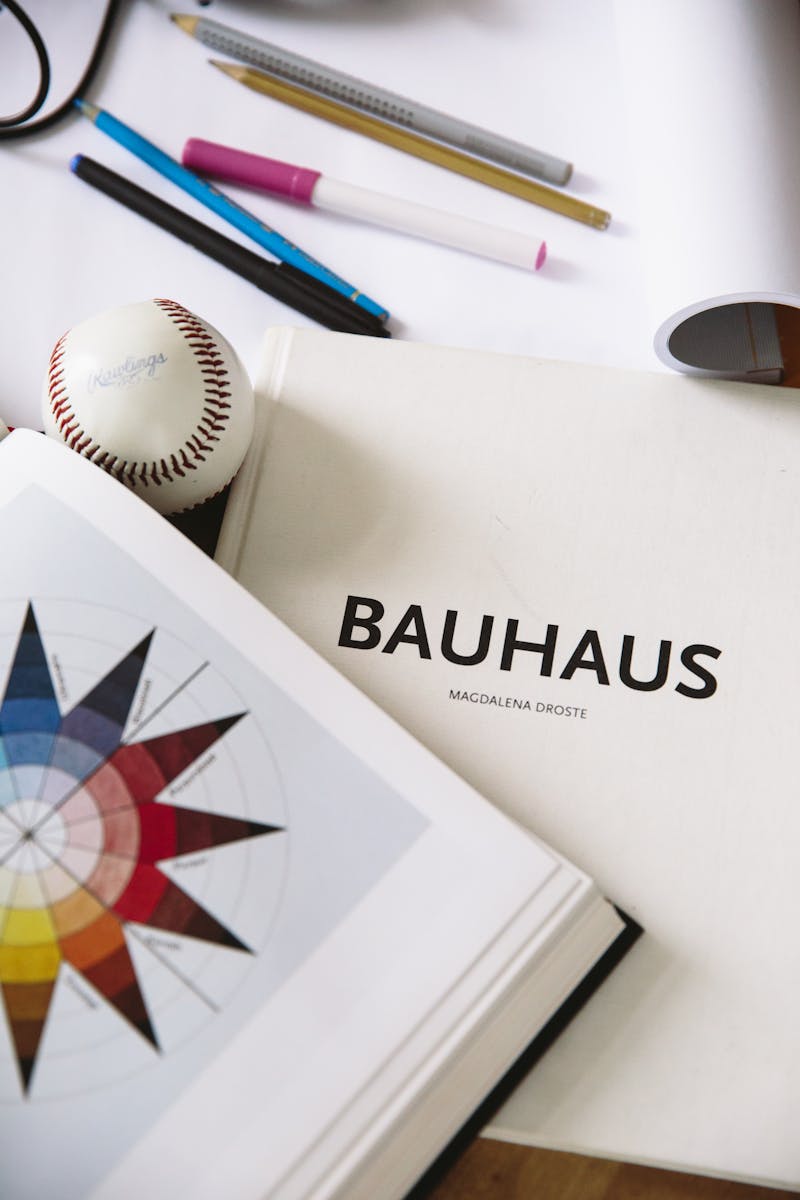
🎨 3. Primary Color Palettes
Red, blue, and yellow dominate, often paired with black, white, and gray. These colors are used not just for aesthetics, but to guide the eye and establish hierarchy.
🔤 4. Bold Typography
Fonts are typically sans-serif, geometric, and unadorned — such as Futura or Helvetica. Typography in Bauhaus is treated as a visual element, often all-caps, carefully spaced, and aligned with the grid.
🖼 5. Minimalism & Functionality
No flourishes. No extras. Every element in a Bauhaus design is purpose-driven, whether it’s a line, shape, or type block. The aesthetic celebrates clarity over complexity.
🧭 6. Asymmetrical Balance
Though grounded in structure, Bauhaus embraces asymmetry to create dynamic compositions. Designs feel active yet stable, often leading the viewer’s eye in intentional directions.
In Summary:
The Bauhaus visual style is a masterclass in functional beauty — where simplicity is powerful, structure is sacred, and design becomes both art and utility. It’s bold, modern, and endlessly influential in both analog and digital contexts.
🎨 Color, Typography & Icon Style in Bauhaus Design
The Bauhaus visual system thrives on clarity, contrast, and core visual logic. Its color, typography, and iconography choices are not just stylistic — they’re fundamental to its philosophy of design serving purpose.
🎨 Color Use in Bauhaus
Bauhaus embraces a primary color palette that reflects clarity, universality, and functional harmony:
-
🔴 Red – Represents strength, action, and energy
-
🔵 Blue – Symbolizes stability, intelligence, and calm
-
🟡 Yellow – Expresses creativity, warmth, and clarity
-
⚫ Black, ⚪ White, and 🩶 Gray – Used as grounding neutrals
These colors are rarely blended or shaded — instead, they appear in pure, unmuted tones for bold visual statements and sharp contrasts that enhance legibility.
🔤 Typography in Bauhaus
Typography in Bauhaus is minimal, rational, and geometric — a visual language in itself:
-
Sans-serif fonts dominate, like Futura, Bauhaus, Helvetica, and other clean, low-contrast typefaces
-
All caps or small caps usage is common to emphasize structure and hierarchy
-
Fonts are often used as graphic shapes, integrated into the design grid
-
Spacing and alignment follow strict principles to maintain harmony and rhythm
Typography is never ornamental — it is precise, utilitarian, and readable.
🔤 Iconography & Symbolism
Icons in Bauhaus design are:
-
Simple, geometric, and flat
-
Often built from basic shapes like circles, lines, and rectangles
-
Designed for maximum clarity and minimum interpretation
-
Sometimes paired with typographic elements in logo and interface design
They reflect the overall machine-age aesthetic of Bauhaus — efficient, functional, and universal.
In Essence:
Bauhaus uses color, type, and iconography as tools of function and form. Everything exists to serve a purpose: to inform, guide, and clarify — all while creating a visually striking and memorable identity.
🧱 Grid, Layout & Composition in Bauhaus Design
At the heart of Bauhaus lies a powerful commitment to order, balance, and structure — and that shows most clearly in its approach to grid systems, layout design, and composition.
Where other movements might chase complexity or chaos, Bauhaus thrives in harmony — using precision-engineered layout frameworks to build beauty from simplicity.
🔲 The Grid is Sacred
Bauhaus design is famously grid-driven. Everything — from typography to imagery — is aligned with mathematical accuracy. Grids allow for:
-
Consistent alignment of elements
-
Predictable hierarchy in both print and digital design
-
Easy modular reuse of components (especially relevant in modern web and UI)
Whether working with a 3-column, 4-column, or 12-column layout, Bauhaus grids prioritize structure over decoration.
↕️ Asymmetrical Balance
Unlike rigid symmetry, Bauhaus often applies asymmetry within its grid — guiding the viewer’s eye through dynamic negative space and unexpected alignments.
This creates a sense of movement and modernity, while still maintaining stability and visual coherence.
🧱 Block-Based Composition
Bauhaus layouts frequently use rectangular blocks of content and color to:
-
Separate sections visually
-
Draw attention to calls to action or headlines
-
Organize information logically and accessibly
This composition style works extremely well in digital interfaces, landing pages, and editorial layouts.
🔄 Modular Design Thinking
Long before “design systems” became a buzzword, Bauhaus introduced the concept of modular components — repeatable layout pieces that could be reused across different formats and media.
This is especially valuable for:
-
Web UI design
-
Presentation decks
-
App interfaces
-
Template systems
In Summary:
The Bauhaus layout system is one of the most influential in design history — combining grids, asymmetry, and modularity into a cohesive language of visual order. It’s as relevant in today’s CSS frameworks and web builders as it was in 1920s print design.
💼 Best Use Cases & Brand Fit for Bauhaus Design
The Bauhaus design style is bold, functional, and iconic — making it a powerful visual language for brands that want to communicate clarity, innovation, and creative intelligence. Its minimalist, structured aesthetic appeals to both form-driven and purpose-driven industries, especially where clean communication and strong visual identity are essential.
🏢 Best Use Cases for Bauhaus Design
Bauhaus works best in contexts that benefit from grid systems, bold typography, and intentional layout. Common applications include:
-
🖥 Tech Startups – Especially those focused on clean data visualization, product simplicity, and modern UI
-
🎓 Education Platforms – For structured learning experiences, minimal distraction, and bold headlines
-
📚 Editorial & Publishing – Bauhaus roots in typography and layout make it perfect for books, magazines, and zines
-
🎨 Creative Agencies & Studios – To showcase a sophisticated and intelligent visual voice
-
🏢 Architecture & Industrial Design Firms – Where the principles of form and function align directly with the brand
-
🛍 E-commerce for Design Goods – Furniture, fashion, decor — Bauhaus aesthetics highlight modern product lines beautifully
-
📊 Data & Analytics Companies – Its grid-based design and geometric clarity are ideal for dashboards and visual reports
-
🧠 Think Tanks & Research Brands – Serious, academic, and clean — it conveys intelligence and trust
🧩 Brand Personality That Fits Bauhaus
If your brand is…
-
Modern
-
Structured
-
Innovative
-
Minimalist
-
Purpose-driven
…then Bauhaus is a strong match. It pairs especially well with brands that want to cut through noise with a clean, authoritative visual language — one that feels intellectual yet artistic.
🚫 When to Avoid Bauhaus
Bauhaus may not be ideal for:
-
Luxury or high-emotion brands that rely on romantic visuals
-
Highly decorative industries like cosmetics or high fashion
-
Playful, whimsical brands looking for more softness or friendliness
In Summary:
Bauhaus is best for brands that want to blend utility with identity — bold enough to stand out, structured enough to scale, and intelligent enough to be taken seriously. It’s not just a style — it’s a philosophy of visual integrity.
📱 Modern Adaptation & Application of Bauhaus Design
Though born over a century ago, Bauhaus design has not only endured — it’s evolved. Its core principles of functionality, minimalism, and geometric beauty remain incredibly relevant, finding new life in today’s digital, brand, and product design landscapes.
🖥️ Web & UI Design
In modern UX/UI, Bauhaus is seen in:
-
Grid-based layouts for landing pages, dashboards, and product sites
-
Flat design aesthetics with sharp edges, clear hierarchy, and bold typography
-
Minimalist navigation and modular sections inspired by the Bauhaus block system
-
Vivid color blocking using primary colors to guide user attention
-
Accessible font choices and high-contrast design elements for clean, intuitive interfaces
Frameworks like Tailwind CSS and design tools like Figma make it easy to implement Bauhaus principles into responsive design.
🖼️ Branding & Visual Identity
Modern brands embracing Bauhaus are:
-
Tech startups aiming for intelligence and clarity
-
Creative agencies looking for bold, academic-inspired branding
-
Design-centric eCommerce stores selling furniture, apparel, or minimalist products
-
Education & research platforms wanting to appear organized, modern, and forward-thinking
The style translates beautifully into logo design, typographic systems, and even packaging, offering a timeless, functional, and confident identity.
🎥 Motion & Interactive Design
Bauhaus principles even influence motion:
-
Modular transitions and animated geometric shapes
-
Scroll-triggered animations that mimic Bauhaus-era kinetic posters
-
Use in Lottie animations, loading screens, or interactive product tours
💬 Social Media & Content Design
Bauhaus works great for bold carousels and content slides where visual hierarchy, clean messaging, and modern minimalism are key to driving engagement.
🧬 Why It Still Works
-
It scales across devices and platforms
-
It simplifies complex interfaces and content
-
It provides a visual language of trust and professionalism
-
It offers a retro-modern feel — vintage yet digital-native
In Summary:
Today’s Bauhaus is not a relic — it’s a blueprint. A style that adapts across branding, UI, motion, and content with timeless precision and universal utility. Whether you’re building a design system, a SaaS dashboard, or a minimalist brand, Bauhaus gives you the structure to simplify, scale, and inspire.
🧩 Template Blocks & Design Patterns That Work in Bauhaus Design
The Bauhaus style is known for its clarity, modularity, and visual precision — making it ideal for template-based design systems that are both beautiful and functional. Its strong grid foundation, geometric language, and minimalist approach lend themselves well to highly reusable, high-performing layout blocks.
Below are the most effective design patterns and template blocks when applying Bauhaus principles across web, UI, and branding:
🔲 1. Modular Grid Sections
-
Why it works: Reflects Bauhaus’ architectural roots and love for structure.
-
Best for: Landing pages, dashboards, portfolios, and product cards.
-
Tip: Use clearly divided rectangles and squares with bold borders or color blocks to create visual rhythm.
🪧 2. Hero Sections with Bold Typography
-
Why it works: Bauhaus champions clean, all-caps sans-serif fonts that immediately grab attention.
-
Best for: Homepage intros, splash pages, campaign headers.
-
Tip: Pair a bold headline with a primary color background and minimal subtext.
🟦 3. Color Blocked Feature Grids
-
Why it works: Primary color usage is core to Bauhaus. Use blocks of red, yellow, blue, or black to separate features or value propositions.
-
Best for: Feature sections, comparison grids, service highlights.
-
Tip: Stick to flat colors with lots of white space around for clarity.
🧑🎓 4. Bio or Profile Cards with Geometry
-
Why it works: The Bauhaus belief in human-meets-machine is perfect for showing people in a structured layout.
-
Best for: Team pages, speaker listings, creator profiles.
-
Tip: Use sharp photo cutouts, circles, or rectangles with clean text and consistent spacing.
📐 5. Icon Rows with Labels
-
Why it works: Bauhaus iconography is flat, geometric, and high contrast.
-
Best for: Services, benefits, quick links.
-
Tip: Use outline or solid icons centered over text, spaced evenly in a horizontal row.
📦 6. Multi-Column Pricing or Plan Layouts
-
Why it works: Bauhaus design handles tables and structure beautifully.
-
Best for: SaaS pricing, subscriptions, product tiers.
-
Tip: Use lines, color headers, and visual hierarchy without over-decoration.
🧱 7. Stacked Testimonials with Type Hierarchy
-
Why it works: Typography is a pillar of Bauhaus. Stack short testimonials using clean fonts with distinct font weights for name, title, and quote.
-
Best for: About pages, landing page social proof.
-
Tip: Keep testimonials in equal-width blocks or within a strict layout to maintain balance.
🧾 8. Accordion or Tabbed Content Sections
-
Why it works: Efficient use of space is a Bauhaus ideal.
-
Best for: FAQs, documentation, product info.
-
Tip: Use sharp-edged tabs with minimal transition animation and clear indicators.
🧮 9. Numbered Feature Steps
-
Why it works: Bauhaus is logical and linear — numbering steps or features reinforces order and clarity.
-
Best for: How-it-works sections, onboarding pages, tutorials.
-
Tip: Pair each step with a bold numeral, minimal icon, and short headline.
🖼 10. Gallery Grids or Portfolio Blocks
-
Why it works: The modular, geometric nature of Bauhaus makes it perfect for displaying many images or items cleanly.
-
Best for: Visual portfolios, product listings, brand showcase pages.
-
Tip: Use uniform image dimensions, hover states, and white space.
In Summary:
The best Bauhaus-inspired template blocks are modular, typographically bold, and geometrically clean. They’re built on strong visual rhythm, minimalism, and functional purpose — making them ideal for performance, reuse, and conversion.
Best Industries for Bauhaus Design


Bauhaus Design Style Website Templates

Bauhaus Design Style Design Assets

Blog Posts


Reviews of Bauhaus Design Style
There are no reviews yet. Be the first one to write one.