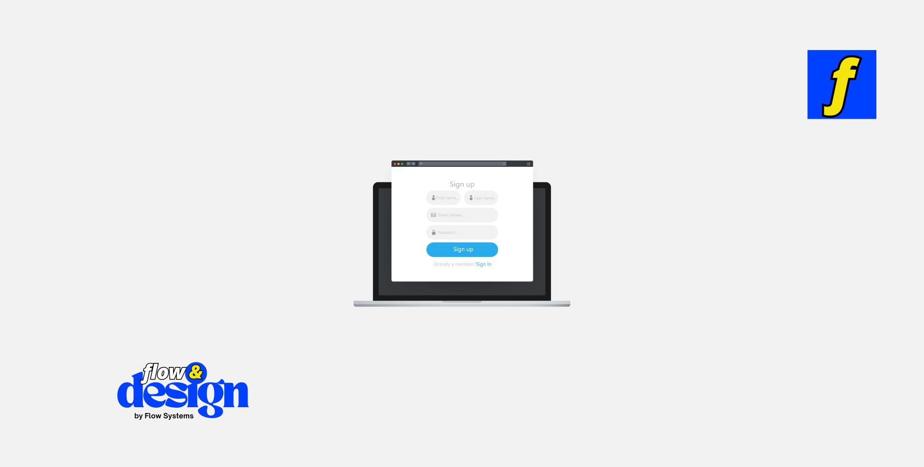
Designing web forms may seem like a simple task, but in reality, it requires careful consideration and planning to create a user-friendly experience. Web forms are an essential part of any website, allowing users to input information, submit requests, and interact with the site.
In this guide, we will explore the best practices for designing web forms that are intuitive, visually appealing, and easy to use.
Importance of User-Friendly Web Forms
User-friendly web forms are crucial for a positive user experience on a website.
When users encounter a form that is difficult to use or confusing, they are more likely to abandon the process and move on to another site. By designing web forms that are easy to understand and navigate, you can increase user engagement, conversions, and overall satisfaction with your website.
Consider the User Experience
When designing web forms, it is essential to consider the overall user experience. Users should be able to easily navigate the form, understand the required fields, and complete the process quickly and efficiently. To improve the user experience, consider the following tips:
Keep It Simple
– Avoid overwhelming users with too many fields or unnecessary information. Keep the form concise and only ask for essential information.
– Use clear and simple language for labels and instructions. Avoid technical jargon or confusing terms that may confuse users.
Use Visual Cues
– Incorporate visual cues such as icons, colors, and spacing to guide users through the form. Use different colors for required fields, error messages, and success messages to help users understand the status of their submission.
– Use a progress bar to show users how far along they are in the form completion process. This can help users stay engaged and motivated to complete the form.
Looking to enhance user experience with well-designed, user-friendly web forms? At Flow & Design, we specialize in creating seamless, responsive forms that make it easy for users to interact with your site. Whether you need lead generation forms, contact forms, or e-commerce checkout designs, our expert team will ensure that your forms are intuitive and optimized for conversions.
Ready to improve your website’s functionality? Explore our pricing options and start your project with us today!
Optimize for Mobile Users
With the increase in mobile device usage, it is essential to design web forms that are mobile-friendly. Mobile users should be able to easily access and complete forms on their devices without any issues. To optimize for mobile users, consider the following tips:
Use Responsive Design
– Ensure that your web forms are responsive and adjust to fit various screen sizes. Test your forms on different devices to ensure they are easy to use on mobile devices.
Simplify Input Fields
– Use input fields that are easy to tap and complete on a mobile device. Avoid using small text fields or dropdown menus that may be difficult to interact with on a touchscreen.
Use Clear Call-to-Actions
Clear call-to-action buttons are essential for guiding users through the form completion process. Use action-oriented language on buttons such as “Submit,” “Next,” or “Continue” to prompt users to take the next step. Consider the following tips for creating effective call-to-actions:
Use Contrasting Colors
– Use contrasting colors for call-to-action buttons to make them stand out on the page. This can help users easily identify where to click to submit the form.
Position Buttons Strategically
– Place call-to-action buttons in prominent positions on the form, such as at the top or bottom of the page. This can help users quickly locate the button and move forward in the form completion process.
Best Practices for Designing Web Forms
In addition to considering the user experience, mobile optimization, and call-to-actions, there are several best practices to keep in mind when designing web forms.
By following these tips, you can create web forms that are intuitive, visually appealing, and easy to use.
Use Consistent Design Elements
Consistency is key when designing web forms. Use consistent design elements such as fonts, colors, and button styles throughout the form to create a cohesive look and feel. This can help users navigate the form more easily and understand the required fields and instructions.
Provide Real-Time Feedback
Real-time feedback is essential for guiding users through the form completion process. Use validation messages to notify users of any errors or missing information in real-time. This can help users correct mistakes quickly and complete the form successfully.
Test and Iterate
Testing is essential for ensuring that your web forms are user-friendly and effective. Conduct usability testing with real users to identify any issues or areas for improvement. Use feedback to make iterative changes to the form design and functionality to create a seamless user experience.
Conclusion
Designing web forms is a critical aspect of creating a positive user experience on a website.
By following best practices for user-friendly design, mobile optimization, and clear call-to-actions, you can create web forms that are easy to use and visually appealing. Remember to consider the user experience, provide real-time feedback, and test and iterate on your designs to create web forms that engage users and drive conversions. By prioritizing user needs and preferences, you can design web forms that enhance the overall usability and functionality of your website.
Products
- Learn Design Basics eBook – A great starting point to understand key principles for user-friendly design.
- Landing Page Design eBook – Learn to create highly effective landing pages with optimized forms.


