Design in Education
Empower Learning
Through Design
Design in the education industry must balance clarity, accessibility, and inspiration — creating user experiences that empower learning at every level.
Design in Education
Empower Learning
Through Design
Design in the education industry must balance clarity, accessibility, and inspiration — creating user experiences that empower learning at every level.
Education Design Insights
✅ Overall Design Score
🎨 Visual Style Flexibility Score
📱 Mobile UX Priority Score
🧠 Design Innovation Score
🧩 UX Complexity Score
🧬 Emotional Design Impact Score
🔐 Compliance & Accessibility Demand Score
🧭 Navigation Simplicity Score
🧱 Template Block Reusability Score
🧍 User Experience Sensitivity Score
🌍 Global Style Variation Score
Overview:
Educational websites require thoughtful design that informs, engages, and motivates. Whether it’s an online course platform, university website, or K–12 learning app, great design in education blends usability with trust. Navigation must be intuitive, interfaces should support information-rich layouts, and visual cues must help users of all ages and skill levels feel empowered and focused. From font choices to call-to-actions, every detail affects comprehension and engagement. In this guide, we’ll explore what design really looks like in the world of learning — and how to do it right.
Whether you’re designing for startups, B2B software, or cutting-edge platforms, this guide explores the styles, layout patterns, colors, and design principles that consistently work — and where bold creativity can still make a difference.
Disclosure: Some links on this page are affiliate links, meaning we may earn a commission if you make a purchase, at no extra cost to you. Other links direct to our own brands or trusted resources.
🎯 Primary Design Objective
🧠 UX Priority
Simplicity + Structure
User experience should guide users through complex information hierarchies without overwhelming them — especially across age and literacy levels.
🎨 Common Design Styles Used
-
Minimalist with editorial touches
-
Flat design for clarity
-
Modern institutional
-
Sometimes playful or illustrated for younger audiences
💡 Color Psychology in the Industry
-
Blues → Trust, knowledge, calmness
-
Greens → Growth, safety, encouragement
-
Yellows → Optimism, alertness (for early education)
-
White/Neutral backgrounds → Clean, open learning space
🔤 Typography Norms
-
Sans-serif fonts like Open Sans, Inter, Roboto for readability
-
Serif fonts for credibility in institutional settings
-
Large headers, ample line spacing, and clear hierarchy are key
🧱 Layout Structures That Work
-
Top nav with dropdowns for sections (Programs, Admissions, Resources)
-
Hero banners with CTAs (Apply Now, Start Course)
-
Grid-based content blocks and modular FAQs
-
Sidebars for resource-heavy sections like libraries or documentation
📱 Responsive Design Importance
Very High
Mobile access is key for students, especially in mobile-first countries and with growing use of edtech apps and portals.
🛠️ Recommended Tools & Platforms
- SiteMake – Website Builder
-
Figma – Interface & prototyping
-
Webflow – No-code for marketing pages
-
WordPress – For content hubs
-
Moodle – for e-learning platforms
-
Luunity – For audio-based education course content
Disclosure: Some links on this page are affiliate links, meaning we may earn a commission if you make a purchase, at no extra cost to you. Other links direct to our own brands or trusted resources.
📎 Design Patterns to Use
-
Course cards / program tiles
-
Step-by-step onboarding
-
Progress trackers
-
Testimonials and student outcomes
-
Integrated resource libraries
-
Sticky nav or mobile tab bars
🔍 SEO/Content Design Role
Crucial
Content-rich design is core: curriculum pages, blogs, resource libraries, and FAQs help drive organic traffic and engagement.
Whether you’re designing for universities, edtech platforms, or K–12 learning environments, Flow Systems delivers tailored education design, development & marketing solutions built for scale and impact. From intuitive UX to high-converting websites and targeted marketing systems, we help forward-thinking educators lead with design.
🧾 Compliance & Accessibility Needs
-
WCAG compliance is a must
-
FERPA or COPPA awareness for student data
-
High contrast, alt text, keyboard navigation all required
🌍 Regional Design Differences
-
U.S. and EU = structured, resource-focused
-
Asia and Latin America = often more visual and community-based
-
Cultural nuances in imagery, uniform design, colors
🏷 Branding Expectations
-
Calm, supportive, and intelligent
-
Often academic, but not cold
-
For younger education: friendly, bright, cartoonish accents
-
For higher ed: timeless, prestigious, and trustworthy
🧩 Template Blocks That Work
-
Hero with value prop and call to action
-
Course or program grid
-
Instructor profile section
-
Timeline or curriculum roadmap
-
Outcome stats (placement rates, alumni success)
💬 Call-to-Action Styles
-
“Get Started Free”
-
“Explore Courses”
-
“Download Syllabus”
-
Clear and confident but non-pushy tone
🧬 Emotional Triggers That Convert
-
Growth and potential
-
Family support or community
-
Curiosity and self-improvement
-
Credibility and future success
🧭 Navigation Best Practices
-
Simple, clear top navigation with dropdowns
-
Breadcrumbs and back buttons
-
Large mobile buttons or expandable menus
🎓 User Familiarity Level
Very Mixed
K–12 → beginners, need more visual cues
College → moderately savvy
Edtech users → varies, UX must be universal and welcoming
📈 Performance Expectations
-
Click-through to course or program pages
-
Newsletter or lead magnet sign-ups
-
Application form starts
-
Engagement with blog/resource content
✨ Design Innovation Opportunities
-
Interactive learning previews
-
Personalized curriculum builders
-
Motion design in course overviews
-
Accessibility-first animations or modes
Primary Design Objective: Education Industry
The primary design objective in the education industry is to communicate clearly and build trust, while creating an experience that supports focused, distraction-free learning. Educational platforms, whether institutional or digital-first, must deliver vast amounts of information in a way that’s easy to navigate, credible, and emotionally reassuring.
Unlike industries where design can lean heavily into aesthetics or persuasion, educational design must prioritize clarity, accessibility, and structure. Every visual decision — from typography to layout — plays a role in knowledge transfer and user confidence.
For higher education, trust and authority are key. For K–12 or learning apps, comfort, simplicity, and intuitive navigation become paramount. And for online courses or edtech brands, the goal often combines engagement with conversion, encouraging users to explore, enroll, or return.
In short, design in education is not just about looking good — it’s about making learning feel possible, valuable, and seamless.
🧠 User Experience Priorities: Education Industry
In the education industry, user experience (UX) must serve as a guide, a support system, and a motivator. The priority is to create interfaces that help users — whether students, teachers, or parents — find what they need quickly and confidently, while feeling encouraged to keep learning.
The UX must prioritize:
1. Clarity Over Cleverness
Users come to educational sites with a goal: to learn, teach, or enroll. That means clear navigation, prominent CTAs (like “Start Learning” or “Apply Now”), and clean layouts that don’t distract from the content.
2. Information Hierarchy & Structure
Education websites tend to have deep layers of content — courses, resources, programs, admissions, etc. Good UX helps users understand where they are, what to do next, and how content is organized logically.
3. Inclusivity & Accessibility
UX in education must work for everyone — including young students, seniors, ESL learners, and users with disabilities. That means larger fonts, intuitive icons, simple language, and screen-reader compatibility are essential.
4. Consistency Across Devices
With students and educators switching between mobile, tablets, and desktops, responsive design isn’t optional — it’s fundamental to UX success.
5. Low Friction, High Confidence
From logging into a portal to starting a course, every step should feel simple, intuitive, and reassuring. Frustration can interrupt learning or lead to drop-offs.
In essence, the UX priority in education is to remove barriers to learning, make users feel empowered and in control, and ensure that the technology supports — rather than competes with — the educational experience.
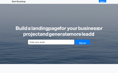
🎨 Design Styles That Work: Education Industry
Design in the education industry must balance authority, approachability, and usability. The styles that thrive here aren’t about trendiness — they’re about trust, clarity, and engagement across diverse age groups and user types.
Here are the top design styles that consistently work in education:
✅ Minimalist & Functional
Clean lines, generous white space, and clear information hierarchy help reduce cognitive load — especially when users are navigating deep content or complex platforms. This style keeps the focus on learning, not visual noise.
✅ Editorial-Inspired Layouts
Borrowed from publishing, editorial styles with strong headlines, structured grids, and bold pull-quotes create credibility and support content-rich environments like university sites, research libraries, or educational blogs.
✅ Illustrated & Playful (for Younger Audiences)
For K–12 and early learning, friendly illustrations, animated characters, and colorful shapes create a sense of fun and safety. This helps build emotional connection and ease.
✅ Modern Institutional
A blend of tradition and tech — using serif typography, muted color palettes, and symmetrical layouts — often seen on higher education websites and academic institutions, where professionalism is key.
✅ EdTech-Driven Modernism
Edtech platforms push design forward with styles that blend flat design, micro-interactions, bold accent colors, and onboarding flows. This works well when the goal is conversion, retention, or gamification.
Common Traits Across All Styles:
-
Clarity first, creativity second
-
Responsiveness across devices
-
Content-forward design
-
Visual hierarchy that supports scanning
Whether you’re building a preschool landing page or a university portal, the key is to match your style with the intent and literacy level of your users — and ensure that aesthetics never get in the way of accessibility or comprehension.
📱 Mobile Responsiveness Demands: Education Industry
In the education industry, mobile responsiveness isn’t optional — it’s critical. Whether it’s students checking grades, parents registering their children, or professionals accessing an online course, more educational touchpoints are happening on mobile devices than ever before.
Here’s why mobile UX matters deeply in this space:
📊 Widespread Mobile-First Behavior
Students (especially Gen Z and Gen Alpha) default to mobile — for everything. From submitting assignments to watching lectures and accessing learning platforms, they expect the experience to be seamless on phones and tablets.
🌍 Global Accessibility
In many parts of the world, mobile is the only device learners have access to. Education platforms that aren’t mobile-optimized risk losing international reach and inclusivity.
🧭 Simplified Navigation is a Must
Mobile UX in education must support deep content with shallow interactions — think expandable menus, large touch targets, sticky headers, and progressive disclosure patterns.
⚙️ Learning On the Go
Asynchronous learning, microlearning, and on-the-go reference material (e.g., flashcards, PDF downloads, quizzes) all require frictionless mobile design.
🧑🏫 Educators & Admins Use Mobile, Too
From updating portals to accessing LMS dashboards, teachers and admin staff also rely on mobile devices, particularly during events, admissions periods, or while on campus.
🧩 Key Mobile Design Considerations:
-
Font readability on small screens
-
Touch-friendly navigation (no tiny links)
-
Mobile-first content hierarchy
-
Performance optimization for slower connections
-
Clear CTAs and course/module access
-
Persistent bottom navigation bars in learning apps
🚦 Bottom Line:
If your educational platform or website isn’t designed with mobile-first principles, you’re risking high bounce rates, frustrated users, and missed enrollment opportunities.
🎨 Color & Typography Psychology in Education Design
In the education industry, color and typography do more than make things look good — they shape how users feel, focus, and learn. The psychology behind these elements plays a vital role in building trust, improving comprehension, and supporting cognitive engagement.
🎨 Color Psychology in Education
Colors set the emotional tone of a learning experience. The best educational designs use color intentionally — to guide attention, establish trust, and reflect age-appropriate energy.
✅ Most Common Colors & Why:
-
🔵 Blue – The most dominant color in education
→ Associated with trust, intelligence, and calm
→ Great for institutional credibility and focus -
🟢 Green – Growth, renewal, and harmony
→ Ideal for learning platforms, environmental topics, or youth education
→ Promotes balance and ease in visual design -
🟡 Yellow – Optimism, curiosity, and energy
→ Often used in early childhood learning for emotional warmth
→ Works well in moderation to highlight important CTAs or playful content -
⚪ White / Neutrals – Cleanliness, clarity, and space
→ Helps reduce cognitive load and keeps content readable
→ Frequently used in academic or editorial-style layouts -
🔴 Red / Accent Colors – Urgency, energy, or warnings
→ Best used sparingly for alerts, errors, or action-driven elements
🔤 Typography Psychology in Education
Typography affects legibility, trust, and the tone of voice. In education, type needs to communicate clearly across reading levels, devices, and cultures.
✅ Common Typographic Choices:
-
Sans-Serif Fonts (like Inter, Open Sans, Roboto)
→ Clean, modern, and highly legible across screens
→ Ideal for digital learning platforms, mobile apps, and edtech tools -
Serif Fonts (like Georgia, Merriweather)
→ Convey formality, tradition, and authority
→ Often used by universities or scholarly publications -
Handwritten or Display Fonts
→ Used selectively in early education or niche creative courses
→ Bring warmth or personality, but should never compromise readability
💡 Best Practices:
-
Use 1–2 typefaces max for consistency and hierarchy
-
Ensure contrast between text and background for accessibility
-
Consider line spacing and font size for all age groups and literacy levels
-
Pair warm colors with simple fonts for emotional engagement
-
Use bold weights and color highlights to emphasize key learning points or calls to action
🧠 The Bottom Line:
In education, color and typography directly influence trust, clarity, and emotional comfort. Get them right, and you’ll guide users through a smoother, more memorable learning journey.
🧱 UI Patterns & Template Blocks That Perform in Education Design
In education design, performance is measured by clarity, engagement, and ease of access to learning resources. Whether you’re designing for a university, online course, or edtech platform, certain UI patterns and content blocks consistently improve usability, conversion, and satisfaction.
🔁 High-Performing UI Patterns in Education
1. 📚 Course Catalog Grids
-
Visual cards with course titles, categories, instructors, and quick links to details or enrollment.
-
Works great for both formal institutions and edtech platforms.
2. 🧑🏫 Instructor or Faculty Profiles
-
Modular bio blocks with photo, name, title, and credentials.
-
Builds credibility and personal connection.
3. 🛠 Resource Libraries & Download Sections
-
Filterable areas with PDFs, syllabi, guides, or videos.
-
Supports autonomy and deep learning at a user’s pace.
4. 📅 Event Calendars & Scheduling Blocks
-
Highlight upcoming classes, open house dates, or webinars.
-
Encourage participation and keep users informed.
5. 🎓 Student Testimonial Sliders
-
Real quotes, names, photos (optional) in rotating or stacked format.
-
Boosts social proof and emotional connection.
6. 🚀 Step-by-Step Enrollment or Application Flows
-
Progress bars, form wizards, or visual guides that walk users through complex processes.
-
Reduce drop-offs and boost conversions.
7. 🔎 Searchable Knowledge Base or FAQ
-
Helps students or parents get answers fast without needing support.
-
Improves satisfaction and lightens admin workload.
8. 🧭 Sticky Navigation + Jump Links
-
Useful for content-heavy pages like degree overviews or admissions info.
-
Keeps users oriented and improves long-page scanning.
9. 📊 Progress Dashboards (for EdTech)
-
Personalized UI showing course progress, badges, or learning milestones.
-
Encourages return visits and gamified learning.
10. 🧩 Hero Sections with Trust Elements
-
Use of video intros, accreditation badges, logos of partner institutions, or callouts like “Trusted by 2M+ students.”
-
Great first impression and immediate validation.
🔧 Template Blocks That Convert Well
-
🎯 Hero + CTA combo (“Start Learning Today” / “Explore Courses”)
-
🧾 Quick Facts Block (e.g., “100+ Programs”, “95% Job Placement”)
-
🖼 Visual Showcase (campus photos, course previews, app interfaces)
-
💬 Testimonial Carousels
-
🧭 Mega Menu or Topbar Navigation for Quick Access
-
🧠 Interactive Quiz / Course Finder Widget
💡 Bonus Tip:
Make every block reusable. Education websites grow — new programs, courses, sessions — so your design system should allow for modular updates without full rebuilds.
🔍 Content Design & SEO Fit in the Education Industry
In education, content design and SEO go hand-in-hand. Unlike industries that rely heavily on visuals or minimal messaging, educational websites must organize, present, and optimize large volumes of content — all while keeping the user focused and engaged.
🧠 Why Content Design Matters in Education
Educational websites are content-rich by nature. From academic programs and course details to student resources, events, blogs, and admissions processes — users expect clear, helpful information at every turn.
Content design in this context means more than writing well. It involves:
-
Structuring information into digestible sections
-
Designing content around real user questions
-
Using visuals (charts, downloads, videos) to clarify concepts
-
Supporting both exploration and deep reading
🔎 SEO’s Critical Role in Educational Growth
SEO isn’t just a marketing strategy — it’s an enrollment tool, a content discovery system, and a thought leadership engine. Whether it’s a parent Googling “best elementary schools near me” or a student searching “how to apply for FAFSA,” every optimized page is a potential entry point.
✅ Key SEO & Content Design Priorities for Education
1. 📚 Program & Course Pages
These should include keyword-optimized titles (e.g., “Online MBA in Marketing”), structured headings, internal links, FAQs, and CTAs — making them ideal for both users and search engines.
2. 🧭 Navigation & URL Structure
Logical hierarchies and clean slugs like /programs/nursing/ help users and Google crawl and understand your site.
3. 🧾 Schema Markup & Rich Snippets
Use structured data for:
-
Courses
-
Events
-
FAQs
-
Reviews
This boosts visibility in search and earns rich result features.
4. 🧠 Content for Search Intent
Blogs, guides, and landing pages should target student or parent search queries like:
-
“How to choose a college major”
-
“Scholarship options for high school seniors”
-
“Best coding bootcamps for beginners”
5. 📈 Performance & Accessibility
Fast load times, mobile optimization, and accessible content (e.g., alt text, readable font sizes) help SEO and UX simultaneously.
💡 Best Practices:
-
Use heading hierarchies (H1, H2, H3) for clarity and SEO
-
Include keywords naturally within the content — avoid keyword stuffing
-
Keep paragraphs short and scannable
-
Include internal links between key pages like “Admissions,” “Programs,” and “Contact”
-
Write meta titles and descriptions that clearly explain what the page offers
📣 Bottom Line:
In education, great content design builds trust, clarity, and rankings. It helps users find answers, make decisions, and move forward in their educational journey — all while positioning your brand as a credible leader in learning.
Build Smarter Education Platforms that Educate, Engage & Convert
Whether you’re designing for universities, edtech platforms, or K–12 learning environments, Flow Systems delivers tailored education design, development & marketing solutions built for scale and impact. From intuitive UX to high-converting websites and targeted marketing systems, we help forward-thinking educators lead with design.
✨ Design Innovation Opportunities in the Education Industry
The education industry is undergoing a massive digital transformation — and design innovation is at the center of that change. While many institutions and platforms still rely on traditional, text-heavy layouts, there’s enormous room for creativity, interactivity, and personalized experiences to reshape how people learn, apply, and engage.
🚀 Where Design Can Break New Ground in Education
1. Personalized Learning Interfaces
Move beyond static dashboards. Use adaptive design to show progress bars, suggested modules, dynamic paths, and even emotion-aware visuals that reflect how the user is feeling or performing.
2. Interactive Visual Learning
Gamified elements, simulations, micro-animations, and drag-and-drop components can turn passive content into active discovery. Think digital flashcards, quiz reveal sliders, or real-time feedback visuals.
3. Storytelling as a Learning Tool
Education design can tap into narrative UX — leading users through courses or topics like chapters in a story, complete with visual metaphors, scroll-triggered milestones, and timeline-style progress.
4. Immersive Experiences
There’s potential to explore 3D visualizations, AR/VR-ready UI blocks, or even ambient sound design that supports focus and context. Imagine a biology course where you “explore” a cell, or a history lesson wrapped in a timeline scroller with animations.
5. Modular Systems for Educators
Design systems could be built with modular blocks that teachers or admin can customize without coding — from creating lesson pages to launching micro-sites for student projects.
6. Data Visualization for Progress
Replace plain percentage stats with beautiful, interactive data visuals: progress rings, achievement badges, or timelines showing course completion, engagement, or attendance — all designed for delight.
7. Culturally Adaptive Design
There’s room for UI and branding that adjusts visually for different countries, languages, or age groups. Design systems that reflect regional aesthetics and reading habits are rare — but powerful.
8. AI-Integrated UI
From smart tutor assistants to real-time content recommendations, interfaces can evolve to feel more like collaborators than static systems.
🎯 The Opportunity:
Education design has a chance to evolve from “informative” to “transformative.”
With the right innovation, it can empower curiosity, adapt to learners, and make every interaction feel human.

Education Website Templates
Education Design Assets

Education Blog Posts

Reviews of Education Industry Design
There are no reviews yet. Be the first one to write one.