Design in Technology
Designing the future —
one tech interface at a time.
Explore how design drives innovation and trust in the technology industry — from SaaS interfaces to developer tools and startup landing pages.
Design in Technology
Designing the future —
— one tech interface at a time.
Explore how design drives innovation and trust in the technology industry — from SaaS interfaces to developer tools and startup landing pages.
Technology Design Insights
✅ Overall Design Score
🎨 Visual Style Flexibility Score
📱 Mobile UX Priority Score
🧠 Design Innovation Score
🧩 UX Complexity Score
🧬 Emotional Design Impact Score
🔐 Compliance & Accessibility Demand Score
🧭 Navigation Simplicity Score
🧱 Template Block Reusability Score
🧍 User Experience Sensitivity Score
🌍 Global Style Variation Score
Overview:
Design in the technology industry isn’t just about aesthetics — it’s about clarity, performance, and user empowerment. From sleek SaaS landing pages to interactive dashboards, great design in tech communicates innovation, builds trust, and simplifies complex products. This industry demands modern UI/UX principles, responsive design, and fast, functional interfaces that speak directly to a tech-savvy audience.
Whether you’re designing for startups, B2B software, or cutting-edge platforms, this guide explores the styles, layout patterns, colors, and design principles that consistently work — and where bold creativity can still make a difference.
Disclosure: Some links on this page are affiliate links, meaning we may earn a commission if you make a purchase, at no extra cost to you. Other links direct to our own brands or trusted resources.
🎯 Primary Design Objective
Tech brands must convey reliability while demonstrating innovation. Whether it’s SaaS or hardware, users expect clean, professional, and future-forward visuals.
🧠 UX Priority
Efficiency + Simplicity
Users in tech want fast access to clear, actionable information. Interfaces must reduce cognitive load, especially for complex products or tools.
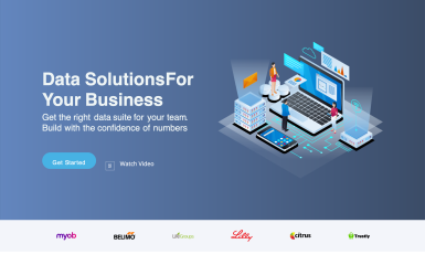
🎨 Common Design Styles Used
-
Minimalism – Focused, whitespace-driven interfaces
-
Neo-Brutalism – For edgier startups or dev tools
-
Glassmorphism – For sleek UI/UX-driven brands
-
Modern Corporate – For B2B, enterprise solutions
💡 Color Psychology in the Industry
-
Blues – Trust, stability, intelligence
-
Whites/Grays – Simplicity, professionalism
-
Neon Accents (Purple, Cyan, Green) – Innovation, tech energy
-
Dark Mode – Especially common for developer-focused or B2B products
🔤 Typography Norms
-
Sans-serif fonts dominate (e.g., Inter, Roboto, SF Pro)
-
Monospace for dev tools or dashboards
-
Large, bold headers + clean body text for clarity
🧱 Layout Structures That Work
-
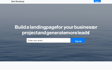
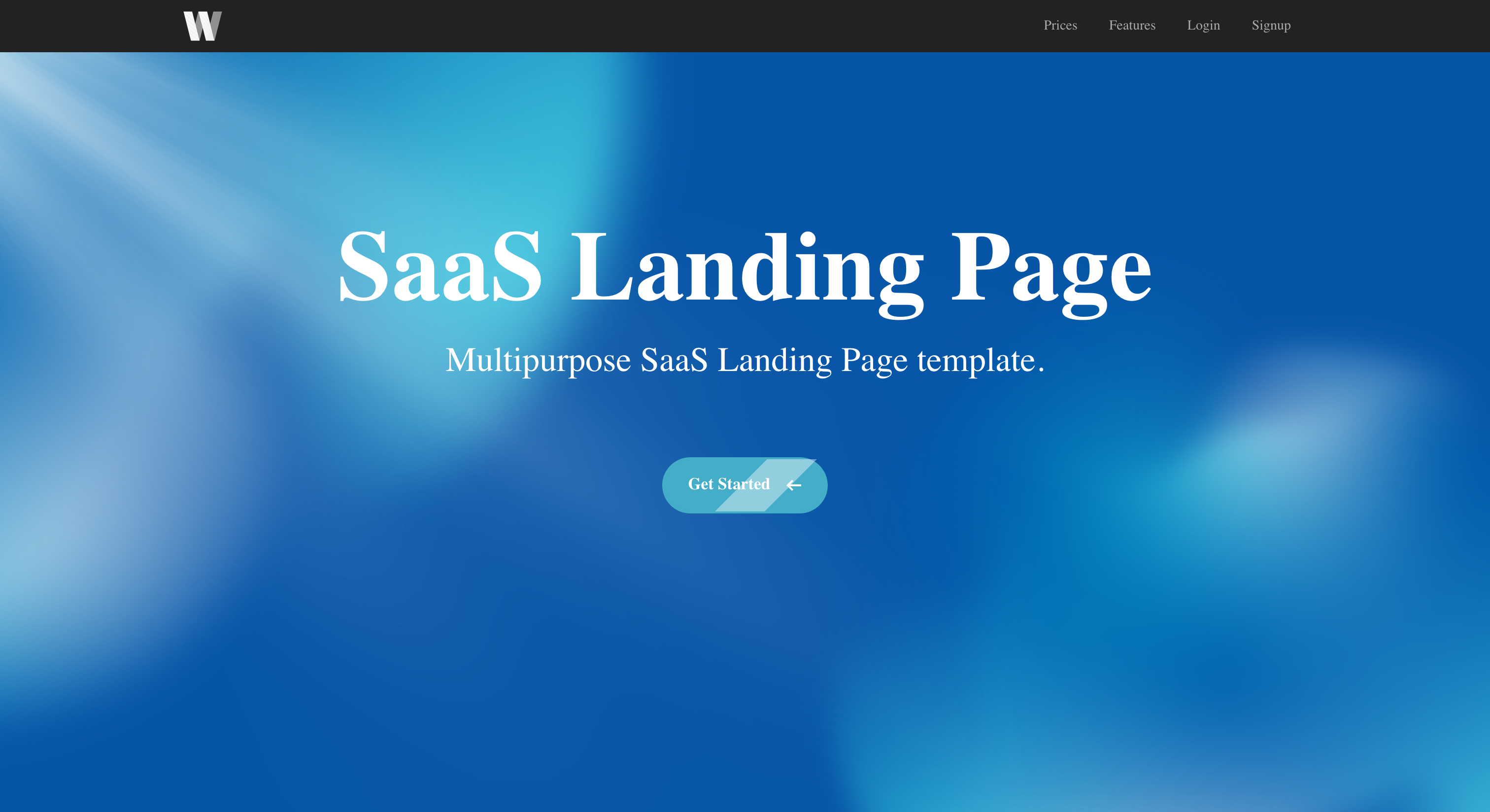
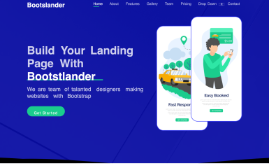
Full-width hero with CTA + product shot
-
3-column feature breakdown
-
Sticky nav or minimal nav bar
-
Modular, scroll-based storytelling
📱 Responsive Design Importance
High
Must be mobile-friendly for SaaS tools, dashboards, and landing pages. Tech-savvy users expect seamless experiences across devices.
🛠️ Recommended Tools & Platforms
- SiteMake – Website Builder
-
Figma – Interface & prototyping
-
Webflow – No-code for marketing pages
-
WordPress – For content hubs
-
Tailwind CSS – For dev-focused sites
-
React/Vue – For app-based UIs
Disclosure: Some links on this page are affiliate links, meaning we may earn a commission if you make a purchase, at no extra cost to you. Other links direct to our own brands or trusted resources.
📎 Design Patterns to Use
-
Pricing tables
-
Interactive feature highlights
-
Animated onboarding or product tour modals
-
Testimonial sliders
-
Integrations showcase
🔍 SEO/Content Design Role
Very Important
Blogs, product documentation, and educational content are key for traffic and trust. Good UX helps retention on long-form content.
At Flow Systems, we specialize in SEO, Marketing, and Automation strategies tailored for the technology industry. Whether you’re launching a SaaS, scaling a startup, or rebranding your platform, our award-winning team is here to help you grow smarter, faster, and more efficiently. 👉 Technology Industry marketing and automation – Let’s build your digital advantage.
🧾 Compliance & Accessibility Needs
-
WCAG for accessibility
-
GDPR & cookie compliance for global reach
-
Data security cues (SSL badges, trust logos) critical for SaaS
🌍 Regional Design Differences
-
Asia: Dense info layouts, vibrant colors
-
Europe: Clean, structured, minimalist
-
U.S.: Bold, conversion-optimized design
Localization matters for dashboards and UX copy
🏷 Branding Expectations
-
Sleek, intelligent, professional
-
Often neutral tones with 1-2 standout colors
-
Focused on user benefit and precision
🧩 Template Blocks That Work
-
Hero: Headline + CTA + UI mockup
-
Feature grid (icons + descriptions)
-
Use case / integration rows
-
Video demo or walkthrough
-
Support/testimonials section
💬 Call-to-Action Styles
-
Bold and confident: “Get Started Free,” “Launch Demo,” “Try It Now”
-
Sticky CTAs or repeating buttons throughout the page
-
Clear contrast and whitespace around CTA areas
🧬 Emotional Triggers That Convert
-
Trust (secure, scalable, proven)
-
Fear of missing out (limited beta, exclusive access)
-
Simplicity (solve pain point fast)
-
Empowerment (grow, scale, build)
🧭 Navigation Best Practices
-
Top nav with 4–6 items
-
Anchored nav or scroll-to sections for long landers
-
Hamburger or sticky nav for mobile
-
Clear separation between product and resources
🎓 User Familiarity Level
Tech-savvy to expert, especially in dev tools or B2B
Hand-holding still necessary in onboarding or for general marketing pages
📈 Performance Expectations
-
Low bounce rate
-
High demo request or sign-up conversion
-
Fast loading time (Google Core Vitals)
-
CTA click-through rate
✨ Design Innovation Opportunities
-
Interactive product storytelling (scroll-triggered animations)
-
Real-time UI previews (input > output flow)
-
Personalization via AI/design assistants
-
Ethical design that promotes transparency in tech

🎯 Primary Design Objective
In every industry, design plays a different role — but there is always one primary goal that leads the creative direction. The Primary Design Objective defines what the design must achieve above all else, whether it’s establishing trust, increasing conversions, telling a compelling story, or ensuring legal compliance.
For example, in the technology industry, the primary design objective is typically clarity and trust. Interfaces must communicate innovation while remaining clean, functional, and intuitive — especially when users are engaging with complex tools or new platforms.
In contrast, industries like fashion or lifestyle often focus on emotional storytelling and visual identity to create a mood or influence perception.
Understanding this objective ensures that every design decision — from layout to color, typography to interaction — contributes to that core goal.
Why It Matters:
-
Helps prioritize design elements that drive real results
-
Guides template choice, asset selection, and tone of branding
-
Aligns with the user’s intent and expectations in that specific field
-
Avoids creative missteps that may confuse or deter the audience
Examples of Primary Objectives by Industry:
| Industry | Primary Design Objective |
|---|---|
| Technology | Build trust and showcase innovation |
| Fashion | Evoke emotion and visual identity |
| Finance | Convey reliability and compliance |
| Health & Wellness | Establish trust and compassion |
| Food & Beverage | Drive appetite and conversions |
| Education | Support clarity and understanding |
| Nonprofits | Inspire empathy and action |
🧠 User Experience Priorities
Every industry has a unique audience with specific expectations, behaviors, and goals. Understanding the User Experience (UX) priorities of that audience is critical to designing interfaces that feel intuitive, valuable, and frictionless.
In the technology industry, UX must emphasize clarity, speed, and functional depth. Users often interact with complex tools, dashboards, or data-driven platforms, so the design must reduce cognitive load, streamline navigation, and guide users toward outcomes — whether that’s exploring features, signing up, or integrating with other tools.
For industries like eCommerce, the priority might be conversion and simplicity — ensuring that checkout flows are effortless. Meanwhile, education or healthcare may require UX to focus on information clarity, accessibility, and step-by-step user guidance.
Key UX Priorities by Industry:
-
Technology: Fast-loading, data-rich, minimal friction, clear calls to action
-
Healthcare: Accessible, trustworthy, emotionally sensitive
-
Education: Structured navigation, clarity, progressive content reveals
-
eCommerce: One-click actions, fast navigation, cart visibility
-
Travel: Visual-first, inspirational, booking flow clarity
-
Finance: Secure, detail-oriented, focused on verification and compliance
Why This Matters:
-
UX decisions directly impact engagement, retention, and conversions
-
Poor UX creates confusion, increases bounce rates, and lowers trust
-
Prioritizing UX based on industry needs ensures better business outcomes and user satisfaction
🎨 Design Styles That Work
Design isn’t one-size-fits-all — especially when it comes to industry-specific expectations. Each sector has certain design styles that resonate with its audience, communicate professionalism, or signal innovation. The key is understanding which styles feel native to that industry while leaving room for creative interpretation.
In the technology industry, clean and modern styles reign supreme. Minimalism is often the go-to — with generous whitespace, sans-serif typography, and grid-based layouts that communicate clarity and control. For cutting-edge startups or developer tools, neo-brutalism and glassmorphism are gaining traction, creating a more expressive and tech-forward visual language.
Meanwhile, industries like fashion or creative services may lean heavily into editorial or expressive styles that emphasize visuals, motion, and emotional tone. Healthcare or legal industries require more restrained, trustworthy visuals — often flat design with muted tones and traditional layouts.
Common Design Styles by Industry:
| Industry | Dominant Design Styles |
|---|---|
| Technology | Minimalism, Neo-brutalism, Glassmorphism |
| Fashion | Editorial, Bold Typography, Scroll-based layouts |
| Finance | Corporate Minimalism, Grid-heavy structure |
| Healthcare | Flat Design, Accessible Color Schemes |
| Education | Clean Layouts, Illustrative Accents |
| E-commerce | Conversion-optimized, Modular, Visual-first |
Why It Matters:
-
Aligning with expected styles builds trust instantly
-
Mismatched styles can confuse or alienate users
-
Choosing the right design style influences brand perception, retention, and conversion
📱 Mobile Responsiveness Demands
In today’s digital landscape, mobile responsiveness is no longer optional — it’s expected. But how critical it is varies from industry to industry. For some, mobile is the primary platform; for others, it’s secondary to desktop workflows. Knowing the demand for mobile UX helps prioritize layout decisions, navigation styles, and performance optimizations.
In the technology industry, especially in SaaS and B2B, users often toggle between devices — starting on mobile but completing deeper tasks on desktop. That means mobile design must support quick access, smooth interactions, and core actions like login, account management, or demo scheduling — even if the full product is used more on desktop.
On the other hand, industries like eCommerce, food delivery, and social media are mobile-first by default. If the site doesn’t feel native on a phone, users will drop off instantly. Meanwhile, sectors like government, legal, or enterprise logistics may still see more desktop-based engagement, but even there, mobile access is increasing year over year.
Mobile UX Priorities by Industry:
| Industry | Mobile Priority | Must-Have Elements |
|---|---|---|
| Technology | High–Critical | Responsive UI, mobile-friendly CTAs, clean nav |
| eCommerce | Very High | Sticky add-to-cart, image zoom, easy checkout |
| Education | Moderate | Readable content, lesson navigation |
| Healthcare | High | Appointment booking, accessibility |
| Finance | High | Secure login, dashboard views |
| Industrial B2B | Lower | Basic contact or service details |
Why This Matters:
-
70%+ of web traffic now happens on mobile
-
Poor mobile design = lost trust and conversions
-
Search engines like Google prioritize mobile-first indexing
-
It influences performance, bounce rate, and overall UX health
💡 Color & Typography Psychology
Design isn’t just visual — it’s psychological. The colors and typography you choose influence how users feel, think, and act on your site. Each industry has subconscious expectations for what feels trustworthy, modern, or credible, and tapping into these norms can dramatically increase user engagement and brand perception.
In the technology industry, color palettes often lean toward cool tones like blues, grays, and teals — colors that convey trust, innovation, and professionalism. Startups may branch out with brighter accents (greens for growth, purples for creativity), while enterprise platforms often stay more conservative with navy, charcoal, or clean white space.
Typography follows suit: most tech brands use modern, sans-serif fonts like Inter, Roboto, or Helvetica Neue to suggest clarity, efficiency, and digital sophistication. For dev tools or technical platforms, monospaced fonts might be used for code-heavy environments, while SaaS dashboards favor clean, legible type at smaller sizes.
Typical Color Psychology by Industry:
| Color | Meaning (Tech Context) | Use Case Example |
|---|---|---|
| Blue | Trust, intelligence | SaaS, enterprise platforms |
| Green | Growth, success, eco | Fintech, startups |
| Purple | Creativity, innovation | AI tools, design tech |
| Gray/Black | Neutrality, professionalism | Developer tools, dashboards |
| White | Clarity, minimalism | Clean UI, modern layout |
Typography Norms:
-
Sans-serif fonts dominate for legibility and modern feel
-
Use of weight and scale (bold for CTAs, light for body) to create hierarchy
-
Monospaced fonts for coding or developer-related interfaces
-
Variable fonts for dynamic, performance-optimized designs
Why It Matters:
-
The wrong color or font can make a brand look outdated or untrustworthy
-
Color and typography work together to guide the user’s eye and emotions
-
They set the tone of your brand before a word is even read
🧩 UI Patterns & Template Blocks That Perform
When designing for any industry, success often comes down to repeating what works. Certain UI patterns and content blocks consistently outperform others — not just in aesthetics, but in usability, clarity, and conversions. These reusable design components form the foundation of high-performing websites and platforms.
In the technology industry, the most effective template blocks are those that communicate value quickly, establish trust, and offer clear action paths. Think SaaS landing pages with pricing tables, feature breakdowns, testimonials, and CTA-driven hero sections. These aren’t just stylistic choices — they’ve been battle-tested across thousands of tech sites.
For example, a homepage might lead with a bold hero statement + sign-up button, followed by sections for benefits, integrations, use cases, and social proof. These blocks create confidence and clarity, reducing decision fatigue and helping users say “yes” faster.
Top-Performing Template Blocks in Technology:
| Block Type | Purpose / Impact |
|---|---|
| 🔝 Hero Section with CTA | Captures attention and directs user action immediately |
| 💬 Testimonial Carousel | Builds trust and social proof from real users |
| 💡 Feature Grid or Cards | Communicates product benefits clearly and quickly |
| 📊 Pricing Table with Tiers | Supports decision-making with side-by-side comparison |
| 🤝 Partner/Integration Logos | Signals credibility through affiliations |
| 🎥 Explainer Video Embed | Simplifies complex ideas through motion |
| 📩 Lead Capture or Signup Form | Converts visitors directly into leads or users |
| 📚 Resource or Blog Feed | Adds SEO value and positions brand as an expert |
| 🧠 FAQ Accordion | Reduces support load and improves transparency |
| 📌 Sticky Navigation / CTA | Keeps actions always accessible during scroll |
Why This Matters:
-
Reusable blocks speed up design time while ensuring performance
-
Familiar UI patterns reduce user friction and improve UX
-
You can build full sites or landing pages using just 5–8 of these core sections
These blocks are the “building bricks” of high-converting designs — and having them available as drag-and-drop assets, templates, or ACF modules makes your platform incredibly powerful.
🔍 Content Design & SEO Fit
In any industry, the balance between visual storytelling and content-driven design determines how well a site performs in both user engagement and search engine visibility. This is especially true in sectors where organic search traffic plays a major role in customer acquisition, education, or long-term trust building.
In the technology industry, content plays a dual role: it must educate while also driving SEO performance. This means designs should accommodate:
-
Blog structures for thought leadership and keyword ranking
-
Feature documentation or help centers
-
Use case pages for bottom-of-funnel conversions
-
Landing pages for PPC and campaign-specific targeting
Successful tech websites structure their content with modular layouts, allowing SEO-driven pages to exist alongside sleek landing pages. That means using repeatable components like:
-
Section headings with keyword-focused subtext
-
Readable body text with strong hierarchy
-
In-content CTAs to capture leads or guide navigation
-
Schema markup and fast loading for technical SEO compliance
Content Design Expectations by Industry:
| Industry | SEO Priority | Content Style |
|---|---|---|
| Technology | High | Case studies, comparison pages, FAQs, blog posts |
| Finance | High | Regulatory explanations, calculators |
| Fashion | Moderate | Product-focused with occasional editorial |
| Education | Very High | Informational long-form content |
| E-commerce | High | Product pages + filters, category pages |
| Legal / Medical | High | Authority-driven, fact-based content |
Why This Matters:
-
Sites that ignore content design lose organic visibility
-
A mismatch between design and SEO intent causes high bounce rates
-
Great content design = higher time on site, more engagement, and more leads
To optimize content for both humans and search engines, your platform should consider offering:
✅ SEO-optimized templates
✅ Content-first layout blocks
✅ Suggested keyword fields and formatting
✅ Mobile readability testing
🚀 Ready to Elevate Your Tech Brand?
At Flow Systems, we specialize in SEO, Marketing, and Automation strategies tailored for the technology industry. Whether you’re launching a SaaS, scaling a startup, or rebranding your platform, our award-winning team is here to help you grow smarter, faster, and more efficiently.
👉 Technology Industry marketing and automation – Let’s build your digital advantage.
✨ Design Innovation Opportunities
Every industry has its norms — and every norm presents a chance to break it. Design innovation is where creativity meets strategic advantage. In a world of sameness, brands that dare to stand out through unexpected design, interaction, or storytelling often win attention, loyalty, and conversions.
In the technology industry, innovation thrives — but it’s also easy to fall into predictable patterns: minimalist layouts, safe colors, and linear user flows. While these work well for usability, they also create visual fatigue. That’s where innovation has room to breathe.
Think about micro-interactions, motion design, data visualizations, dark mode options, or personalized UX. These elements push boundaries while still respecting user expectations. Tech users, especially developers and early adopters, are often design-literate and open to clever, functional creativity.
Where Design Innovation Shines in Tech:
| Area | Innovation Opportunity |
|---|---|
| ⚙️ Onboarding UX | Gamify setup, add interactive tutorials |
| 📊 Data Display | Use custom infographics or animated charts |
| 🧭 Navigation | Smart sidebars, command menus, or AI helpers |
| 🌙 UI Personalization | Dark mode, font size toggles, layout themes |
| 📦 Product Showcases | Scroll-triggered 3D views or live demos |
| 🧬 Brand Expression | Quirky microcopy, animated mascots, sound design |
| 🛠 Modular Layouts | Let users rearrange dashboards (drag and drop) |
| 🔮 Predictive Interactions | Use behavior data to show next best action |
| 🔗 API / Integration Pages | Show live data, plug-and-play guides |
| 🎮 Dev & Beta Communities | Create gamified community spaces or feedback loops |
Why It Matters:
-
Design innovation sets brands apart in saturated markets
-
It creates emotional impact that users remember and share
-
It turns functional sites into delightful product experiences
The best part? You don’t need to reinvent the wheel — just customize the spokes. Even small moments of delight can create a brand that feels fresh, forward-thinking, and fun to use.
Technology Website Templates
Technology Design Assets

Reviews of Technology Industry Design
There are no reviews yet. Be the first one to write one.