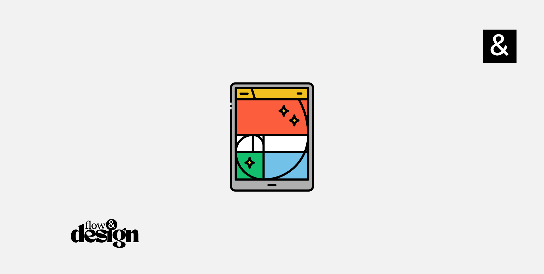
In the realm of design, few principles have captivated the imagination and guided the hand of artists and creators as much as the Golden Ratio. This mathematical marvel, often denoted by the Greek letter φ (phi), has been the secret sauce behind some of the most awe-inspiring architecture, art, and even natural phenomena. But what happens when this age-old principle meets the modern canvas of web design? The result is a harmonious blend of aesthetic appeal, functional layout, and an intuitive user experience that feels just right.
As we navigate through the digital age, the importance of web design has never been more pronounced. Websites are the storefronts, portfolios, and social platforms of today, and how they are designed can make or break the user experience. In this comprehensive guide, we delve into the fascinating world of the Golden Ratio and explore how this ancient principle can breathe life into web design. From layouts and typography to responsive designs and call-to-action buttons, we’ll uncover the golden secrets that can transform your website into a masterpiece of digital artistry.
So, fasten your seatbelts and prepare for a journey into the intersection of mathematics and art, where each pixel is placed with purpose and each design choice echoes the whispers of Fibonacci. Welcome to the world of the Golden Ratio in Web Design.
What is The Golden Ratio?

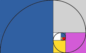
The Golden Ratio, often symbolized by the Greek letter φ (phi), is a mathematical constant that approximately equals 1.618033988749895. This number has fascinated mathematicians, artists, and designers for centuries due to its unique properties and aesthetic appeal. But what makes it so special?
The Mathematical Essence
The Golden Ratio is derived from the Fibonacci sequence—a series of numbers in which each number is the sum of the two preceding ones, starting from 0 and 1. In simpler terms, the Golden Ratio is achieved when a line is divided into two parts in such a way that the ratio of the whole line to the longer segment is the same as the ratio of the longer segment to the shorter segment. This ratio is always 1.618033988749895, or φ.
Aesthetic Harmony
The allure of the Golden Ratio extends beyond numbers; it’s a principle deeply rooted in aesthetic harmony and balance. From the Parthenon in Athens to Leonardo da Vinci’s Mona Lisa, the Golden Ratio has been employed to create compositions that are pleasing to the eye.
The Universal Principle
What’s truly fascinating about the Golden Ratio is its universal application. It’s found in nature—in the arrangement of leaves, the branching of trees, and even in the spiral of galaxies. It’s as if this mathematical principle is a fundamental building block of the universe, a cosmic rule that governs the structure of everything beautiful and harmonious.
Relevance in Web Design
In the context of web design, the Golden Ratio serves as a tool to create layouts, typography, and visual elements that are proportionally balanced and aesthetically pleasing. It provides a mathematical basis for design decisions, making it easier to create a website that resonates with the innate human sense of beauty and harmony.
In the following sections, we will delve deeper into how this timeless principle can be applied to various aspects of web design, from the layout of your web pages to the size and placement of text and buttons. Prepare to see your website through a new lens—one that has been refined over millennia and is now ready to elevate your digital presence to an art form.
By understanding the Golden Ratio, you’re not just adding another tool to your design toolkit; you’re connecting with a principle that has shaped beauty and order for centuries. And now, it’s time to bring that principle into the digital age.
Why the Golden Ratio Matters in Web Design
In an era where web design has become increasingly complex, laden with interactive elements, multimedia, and ever-changing user expectations, the need for a foundational design principle has never been more crucial. This is where the Golden Ratio comes into play. But why does this ancient mathematical concept matter in the realm of pixels and code? Let’s delve into the compelling reasons.
Visual Harmony
The Golden Ratio is not just a number; it’s a visual language that speaks to the innate human sense of beauty and balance. By applying the Golden Ratio to your web design elements—be it layout, typography, or images—you create a natural flow that guides the eye and pleases the senses.
Improved User Experience
A well-designed website is not just about aesthetics; it’s about how easily users can navigate and interact with it. The Golden Ratio helps in organizing elements in a way that aligns with natural human perception. This makes it easier for users to find what they’re looking for, thereby improving overall user experience.
Consistency Across Platforms
In today’s multi-device world, your website needs to look good and function well on a variety of screen sizes. The Golden Ratio provides a consistent mathematical framework that can be applied to responsive design, ensuring that your website maintains its visual appeal across different platforms.
Brand Perception
First impressions matter, especially in the digital world. A website designed with the Golden Ratio in mind exudes a sense of professionalism and attention to detail. This can significantly elevate your brand’s perception, making you stand out in a crowded digital landscape.
Timeless Appeal
Design trends come and go, but the Golden Ratio has stood the test of time. By incorporating this principle into your web design, you’re investing in a layout and aesthetic that will remain appealing and effective for years to come.
Competitive Edge
In a digital marketplace where everyone is vying for user attention, having a website that is both visually stunning and user-friendly can give you a significant competitive advantage. The Golden Ratio offers a proven, mathematical approach to achieving this balance.
A Foundation for Creativity
While the Golden Ratio provides a structured approach to design, it’s not restrictive. On the contrary, it serves as a foundation upon which you can unleash your creativity, safe in the knowledge that the end result will be harmonious and engaging.
In summary, the Golden Ratio is not just an esoteric concept reserved for artists and mathematicians; it’s a practical tool that can elevate your web design to new heights of beauty, functionality, and user engagement. By understanding and applying this principle, you’re not just following a trend; you’re adhering to a universal law of aesthetic appeal—one that will imbue your website with a sense of timeless elegance and intuitive usability.
Golden Ratio in Web Layouts

The layout is the backbone of any website; it’s the framework that holds your content, images, and interactive elements. But how can the Golden Ratio be applied to something as foundational as a web layout? The answer lies in understanding the principle of proportionality and balance that the Golden Ratio offers.
The Grid System
One of the most effective ways to apply the Golden Ratio in web layouts is through the grid system. By dividing your layout into columns and rows based on the Golden Ratio, you create a harmonious structure that naturally guides the viewer’s eye. For instance, if your main content area is 1000 pixels wide, the sidebar could be approximately 618 pixels, maintaining the ratio of 1.618.
Content Blocks
When organizing content blocks, consider using the Golden Rectangle—a rectangle whose sides are in the Golden Ratio. Placing key elements like headlines, images, or call-to-action buttons within these Golden Rectangles ensures that they are proportionally balanced and aesthetically pleasing.
Visual Hierarchy
The Golden Ratio can also help establish a visual hierarchy on your web page. By scaling elements like headers, sub-headers, and text in a ratio of 1:1.618, you create a natural flow that makes it easier for users to absorb information.
Spacing and Margins
Even the spaces between elements can be optimized using the Golden Ratio. The use of white space is crucial in modern web design, and applying a Golden Ratio to margins, padding, and spacing between elements can make your layout feel less cluttered and more balanced.
Responsive Design
As we move towards a mobile-first approach, the Golden Ratio becomes even more relevant. By maintaining these proportions as your layout scales down to fit smaller screens, you ensure that the design remains visually appealing and functional across all devices.
Life Design Integration
Interestingly, the principles of the Golden Ratio in web layouts can also be seen as a metaphor for life design—creating a balanced, harmonious life. Just as the Golden Ratio brings balance and beauty to web layouts, understanding and applying the principles of proportionality and balance in life can lead to a more fulfilling and harmonious existence.
Final Thoughts
Incorporating the Golden Ratio into your web layout is not just about making your website look good; it’s about creating a more effective, engaging, and universally appealing user experience. It’s a testament to the enduring power of this ancient mathematical principle that it finds such critical application in the digital landscapes of the 21st century.
By consciously applying the Golden Ratio to your web layouts, you’re not just being a designer; you’re being a mathematician, an artist, and a philosopher, all rolled into one. And the result? A website that stands the test of time, much like the Golden Ratio itself.
Typography and the Golden Ratio

Typography is often considered the unsung hero of web design. It sets the tone, delivers the message, and guides the reader through the labyrinth of content. But how can the Golden Ratio elevate the art of typography in web design? Let’s explore this fascinating intersection of math and type.
Font Size and Line Height
The Golden Ratio can serve as a guide to set the ideal font size and line height. If your base font size is 16px, multiplying it by 1.618 gives you a line height of approximately 26px. This creates a comfortable reading experience, where the text neither feels cramped nor too spaced out.
Font Pairing
Choosing fonts that work well together is a challenge. The Golden Ratio can help here too. If your body text is set at 16px, then a header set at approximately 26px (16 x 1.618) will maintain a harmonious relationship between the two.
Text Blocks and Columns
When laying out text in columns or blocks, the width-to-height ratio can be set in accordance with the Golden Ratio. This ensures that the text is easily readable and aesthetically pleasing, whether it’s a short caption or a long paragraph.
Letter Spacing and Word Spacing
Even the spaces between letters (kerning) and words can be optimized using the Golden Ratio. By adjusting these spaces in a way that aligns with the ratio, you can achieve a balanced and harmonious look that enhances readability.
Text and Element Alignment
The Golden Ratio can also guide the alignment of text within design elements like buttons, banners, and cards. By ensuring that the text aligns within a Golden Rectangle or along a Golden Spiral, you create a natural focal point that draws the reader’s attention.
The Impact on User Engagement
Typography that adheres to the Golden Ratio principles is not just visually appealing; it also impacts user engagement. Well-proportioned text encourages readers to spend more time on your site, thereby reducing bounce rates and increasing the likelihood of conversion.
A Universal Principle
What’s truly remarkable is that the Golden Ratio’s application in typography transcends cultural and linguistic barriers. It’s a universal principle of design that resonates with a wide audience, making your website globally appealing.
Final Thoughts
The Golden Ratio and typography are like two sides of the same coin, each enhancing the other to create a perfect balance. By applying the Golden Ratio to your typography settings, you’re not just making stylistic choices; you’re tapping into a mathematical formula that has been admired for its aesthetic properties since antiquity.
In the realm of web design, where content is king, typography is the crown. And the Golden Ratio? Well, consider it the jewel that makes the crown truly shine.
Golden Spirals in User Flow

In the world of web design, user flow is akin to a well-choreographed dance. It’s the journey a user takes through your website, from the landing page to the final call-to-action. But what if we told you that this journey could be elevated to an art form, guided by the mathematical elegance of the Golden Spiral? Intrigued? Let’s delve deeper.
The Fibonacci Sequence and User Experience
The Golden Spiral is derived from the Fibonacci sequence, a series of numbers where each number is the sum of the two preceding ones. This sequence is not just a mathematical curiosity; it’s a pattern that appears in nature, art, and now, user experience design.
The Landing Page as the Focal Point
Imagine your website’s landing page as the center of the Golden Spiral. This is where the user’s journey begins. The most critical elements—your value proposition, primary CTA, and key features—should occupy this focal point. It’s where the eye naturally gravitates, making it the ideal spot for your most compelling content.
Guiding the User’s Eye
As the user scrolls down or clicks through to other pages, the Golden Spiral serves as a visual guide. Elements should be placed in a way that the eye naturally follows the curve of the spiral. This could mean positioning secondary CTAs, testimonials, or additional features along this path.
Layering Information
The Golden Spiral is all about progression and growth. As the user moves further along the spiral, the information presented should also evolve. Start with the essentials and gradually introduce more detailed content, ensuring that the user is neither overwhelmed nor left wanting.
Interactive Elements and Micro-Interactions
Even the interactive elements like buttons, forms, and menus can be aligned with the Golden Spiral. Micro-interactions, such as hover effects or animation transitions, can be timed to the Golden Ratio, offering a harmonious and engaging user experience.
The Mobile Experience
In a mobile-first world, the Golden Spiral adapts seamlessly. The spiral’s curve can be translated into vertical scrolling or swipe gestures, ensuring that the mobile user flow is just as engaging and intuitive as on a desktop.
Life Design and User Flow
Interestingly, the concept of the Golden Spiral can be extended to life design—the art of living a balanced and fulfilling life. Just as the Golden Spiral provides a natural and pleasing path for the user, life design offers a framework for a meaningful and enriching life journey.
Final Thoughts
The Golden Spiral in user flow is not just a design gimmick; it’s a thoughtful approach to creating a natural, engaging, and aesthetically pleasing user experience. It’s about understanding human behavior through the lens of mathematical beauty—a concept as old as time but as relevant as ever in the digital age.
By incorporating the Golden Spiral into your user flow, you’re not just designing; you’re orchestrating an experience. And in doing so, you’re creating a website that not only looks good but also feels intuitively right.
Responsive Design and the Golden Ratio

In the ever-evolving landscape of web design, responsiveness is no longer a luxury; it’s a necessity. With a myriad of devices, screen sizes, and orientations, a one-size-fits-all approach is a relic of the past. But how can we ensure that our designs are not only responsive but also aesthetically pleasing across all platforms? Enter the Golden Ratio—a mathematical constant that brings harmony and balance to design. Let’s explore how the Golden Ratio can elevate your responsive designs to the realm of art.
The Golden Ratio: A Quick Recap
The Golden Ratio, often denoted by the Greek letter φ (phi), is approximately 1.618033988749895. In design, it’s often used to create aesthetically pleasing proportions. When applied to responsive web design, it ensures that elements scale harmoniously, maintaining their visual appeal across different screen sizes.
Grid Systems and the Golden Ratio
A responsive grid system is the backbone of any flexible design. By incorporating the Golden Ratio into your grid, you can create columns and rows that are proportionally balanced. For instance, if one column is 618 pixels wide, the adjacent column could be 382 pixels, adhering to the Golden Ratio.
Images and Media
When resizing images and media elements, the Golden Ratio can serve as a guide to maintain their aspect ratios. This ensures that images look as stunning on a mobile screen as they do on a 4K monitor.
Typography
Even your choice of fonts and line spacing can benefit from the Golden Ratio. For example, if your main body text is 16px, then applying the Golden Ratio would suggest a line-height of approximately 26px for optimal readability.
Navigation Menus
In responsive design, navigation menus often need to be restructured to fit smaller screens. Using the Golden Ratio, you can prioritize and scale menu items in a way that’s both functional and visually balanced.
Life Design and Responsiveness
Interestingly, the principles of the Golden Ratio can also be applied to life design—the art of living a balanced and fulfilling life. Just as responsive design adapts to different screens, life design is about adapting to different phases and challenges in life, maintaining a sense of balance and proportion.
Final Thoughts
The Golden Ratio is not just a mathematical concept; it’s a universal aesthetic principle that can bring harmony and balance to any design. By integrating the Golden Ratio into your responsive design strategy, you’re not merely adapting to various screen sizes—you’re doing so in a way that is visually and intuitively harmonious.
Golden Ratio in Call-to-Action (CTA) Buttons

The Call-to-Action (CTA) button is arguably one of the most critical elements on a webpage. It’s the gateway to conversions, the final nudge that propels a visitor to become a customer. But how do you design a CTA button that not only grabs attention but also feels naturally integrated into the overall design? The answer lies in the Golden Ratio, a mathematical principle that has been used for centuries to create aesthetically pleasing designs.
The Importance of CTA Buttons
Before diving into the Golden Ratio, let’s understand why CTA buttons are so crucial. These buttons serve as the focal point of your conversion funnel, guiding users toward a specific action, whether it’s signing up for a newsletter, making a purchase, or downloading an eBook. The design of the CTA button can significantly impact the user’s decision to click or not.
Applying the Golden Ratio to CTA Buttons
The Golden Ratio can be applied to the dimensions of the CTA button to make it more visually appealing. If the width of the button is ‘X,’ then the height should ideally be ‘X/1.618’ to maintain the Golden Ratio. This proportion creates a button that is not too square and not too elongated, but just right.
Text and Padding
Even the text inside the CTA button and the padding around it can be optimized using the Golden Ratio. If your text size is 14px, then applying the Golden Ratio would suggest a padding of approximately 23px for optimal visual balance.
Color and Contrast
The Golden Ratio can also guide the color scheme of your CTA buttons. Choose a primary color and then use the Golden Ratio to find complementary colors that create a harmonious contrast, making the button stand out yet feel integrated into the overall design.
Positioning the CTA
The placement of your CTA button on the page can also benefit from the Golden Ratio. Divide your webpage into sections based on the Golden Ratio to find the most effective spot for your CTA. This ensures that the button is naturally where the eye is drawn.
Life Design and CTA Buttons
Interestingly, the concept of the Golden Ratio extends beyond web design into life design—the art of living a balanced and fulfilling life. Just as a well-placed and well-designed CTA can guide a user to take action, the principles of life design can guide you to make balanced decisions that lead to fulfillment and happiness.
Golden Ratio in Web Forms

Web forms are the unsung heroes of user interaction. They are the bridges that connect a user’s intent to a website’s functionality, whether it’s signing up for a newsletter, filling out a survey, or making a purchase. But how can we make these forms not just functional but also visually appealing and user-friendly? The answer, once again, lies in the Golden Ratio—a principle that can transform the mundane into the magnificent.
The Anatomy of a Web Form
A typical web form consists of various elements: text fields, checkboxes, radio buttons, and of course, the submit button. Each of these elements plays a crucial role in capturing user information and needs to be designed with care.
Applying the Golden Ratio to Form Fields
When it comes to the dimensions of form fields, the Golden Ratio can be a valuable guide. If the width of a text field is ‘X,’ then its height should ideally be ‘X/1.618’ to maintain the Golden Ratio. This ensures that the text fields are neither too square nor too elongated, providing a comfortable space for users to enter their information.
Spacing and Margins
The spacing between form fields is another area where the Golden Ratio can be applied. If the height of a text field is ‘Y,’ then the space between successive fields could be ‘Y/1.618,’ creating a balanced and harmonious layout.
Submit Button Design
Even the submit button can benefit from the Golden Ratio. Similar to the Call-to-Action (CTA) buttons, the dimensions, text size, and padding around the submit button can be optimized using the Golden Ratio to create a visually appealing and effective element.
Form Layout
The overall layout of the form can also be designed based on the Golden Ratio. For instance, if you have a multi-step form, you can divide the steps or sections according to the Golden Ratio to guide the user’s eye naturally from one section to the next.
Life Design and Web Forms
The Golden Ratio is not just a principle for inanimate objects; it’s a universal aesthetic that can be applied to life design. Just as a well-designed form makes the user’s interaction smooth and enjoyable, applying the principles of balance and proportion in life design can lead to a more fulfilling and harmonious life.
Conclusion: The Golden Ratio—A Timeless Principle for Modern Web Design
In the realm of web design, where aesthetics and functionality must coalesce into a seamless user experience, the Golden Ratio emerges as a timeless guide. From the overarching layout to the minute details of typography, from the spirals that guide user flow to the dimensions of call-to-action buttons and web forms, this mathematical marvel offers a blueprint for aesthetic harmony and functional efficiency.
Read What is Web Development? A Comprehensive Guide to Building the Web
The Golden Ratio is not just a design principle; it’s a universal aesthetic that transcends cultures and disciplines. Its application in web design can elevate your website from being merely functional to genuinely captivating, creating a memorable experience for every visitor.
As we’ve explored, the Golden Ratio’s applications are vast and varied, making it a versatile tool for any web designer aiming for excellence. Whether you’re a seasoned designer or a beginner, understanding and applying the Golden Ratio can significantly enhance the quality of your work, setting you apart in this competitive digital landscape.
If you’re passionate about creating websites that are not just visually stunning but also user-centric, Flow & Design is here to help. Our design philosophy is deeply rooted in the principles of the Golden Ratio, ensuring that every project we undertake is a harmonious blend of form and function. Let us help you create a website that is, quite literally, a golden standard.