In today’s digital age, having a responsive website design is essential for businesses of all sizes. With the increasing use of smartphones and tablets, it’s crucial to ensure that your website looks great and functions seamlessly on any device.
In this comprehensive guide, we’ll dive into the world of responsive website design and explore how it can help you boost your online presence.
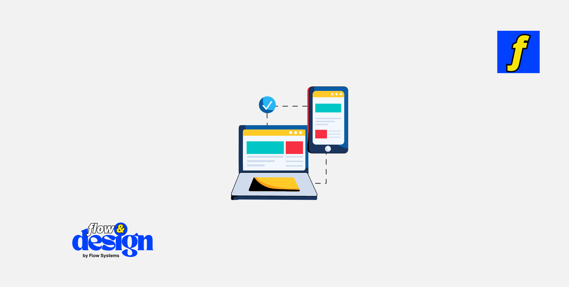
What is Responsive Website Design?
Responsive website design is an approach to web design that ensures a website looks and functions optimally on any device, including desktops, laptops, smartphones, and tablets.
With a responsive design, the layout of the website automatically adjusts to fit the screen size of the device being used, providing an optimal user experience. This means that visitors can easily navigate your website, read content, and interact with your site regardless of the device they are using.
Benefits of Responsive Website Design
There are numerous benefits to having a responsive website design, including:
Improved User Experience
One of the primary benefits of responsive website design is the improved user experience it provides. With a responsive design, visitors can easily navigate your website, find information quickly, and interact with your site without any issues. This can lead to increased engagement, lower bounce rates, and ultimately more conversions.
Better SEO Performance
Having a responsive website design can also improve your SEO performance. Search engines like Google prioritize mobile-friendly websites in their search results, so having a responsive design can help boost your rankings. Additionally, responsive websites are easier to maintain and manage, making it easier to implement SEO best practices.
Increased Reach
With the increasing use of smartphones and tablets, having a responsive website design can help you reach a wider audience. By ensuring that your website looks great and functions seamlessly on any device, you can attract more visitors and potential customers to your site.
Cost-Effective
While initially, designing a responsive website may require an investment, it can ultimately be cost-effective in the long run. With a responsive design, you only need to maintain one website, rather than separate desktop and mobile versions. This can save you time and money on maintenance and updates.
Ready to take your website to the next level? Our team at Flow & Design specializes in creating stunning, responsive websites tailored to your needs. Get started with our agency and watch your online presence grow today!
Best Practices for Responsive Website Design
When designing a responsive website, there are several best practices to keep in mind to ensure optimal performance:
Mobile-First Approach
When designing a responsive website, it’s essential to take a mobile-first approach. This means designing the mobile version of your website first and then scaling up for larger devices like tablets and desktops. By starting with the smallest screen size, you can ensure that your website looks great and functions seamlessly on all devices.
Optimize Images and Media
To ensure fast loading times and optimal performance on all devices, it’s important to optimize images and media for your responsive website. Use compressed images and videos and consider lazy loading to improve loading times on mobile devices.
Use Fluid Grids and Flexible Layouts
Instead of using fixed-width layouts, opt for fluid grids and flexible layouts when designing a responsive website. This allows your website to adapt to different screen sizes and resolutions, providing a consistent user experience across devices.
Test Across Devices
Before launching your responsive website, be sure to test it across various devices and screen sizes to ensure that it looks and functions as intended. Use tools like Google’s Mobile-Friendly Test to check your website’s responsiveness and identify any issues that need to be addressed.
Conclusion
Responsive website design is a crucial aspect of any modern website, allowing businesses to reach a wider audience and provide an optimal user experience.
By following best practices and optimizing your website for all devices, you can boost your online presence and attract more visitors and customers to your site. If you’re looking to improve your website’s performance and stay ahead of the competition, investing in responsive website design is a smart choice.
Recommended Products
- Landing Page Design eBook – Master the art of creating high-converting landing pages with this in-depth guide.
- Learn Design Basics eBook – A must-read for beginners looking to understand web design fundamentals.
- AI Writing Assistant – Quickly generate high-quality content for your website with this powerful AI-driven tool.
- Visual Content Creation Tool – Access unlimited design assets to enhance your web design with beautiful visuals.